8 levers to optimize your conversion funnel

A conversion funnel is the journey a visitor takes from the moment he lands on your website to a conversion. Ex: Homepage > product page > checkout. A visitor goes through 5 stages: awareness, engagement, consideration, conversion and retention. Your role as a marketer is to facilitate and accelerate your visitors' journey through these steps. But how? Glad you asked ? There are obviously a plethora of tactics, techniques or hacks for this, but using them blindly without the big picture is short-sided, to say the least. Because they’re quick fixes, bandaids you’re just implementing with superficial knowledge as to why they would work (or not). We’re not going to do that here. I mean, I appreciate my bandaids like the next man, but sometimes we’d all benefit from a look at the underlying principles. That’s how you make the most out of the quick fixes by the way and how YOU can come up with clever tactics on your own. So, what about these principles? Well, there are 8 levers to influence conversions and optimize your funnel:
- Perception
- Relevance
- Clarity
- Usability
- Trust
- Friction
- Scarcity
- Retention / Reengagement
Let’s take a look!
1. Perception
Whatever we say about beauty being on the inside, first impressions—or what your website/brand looks like, are critically important. Actually, you have about 50ms to make a good first impression (that’s the time needed by your visitors to decide if they find your site or product appealing or not). If it’s ugly, looks like it came out of a time machine, if the tone of your copy isn’t aligned with your audience, these are all barriers you set in the minds of your visitors before they even approach anything resembling a CTA or God forbid, move forward in your funnel. Another stat for fun, 94% of a website user’s first impressions are design-related. You can’t go wrong by making things easier on the eye as long as it doesn’t hurt the other 7 principles. Well, let me amend that a touch: if you have a long-lasting clientele, that has built habits with your website, sometimes the old and uglier version will convert more. And what you or your designer(s) might find prettier isn’t necessarily what your users do. Don’t assume, experiment. That’s what A/B testing is for, right?
2. Relevance
Does the content on your page closely match what your visitors expect to see? Does it answer their needs? Are you using what you already know from them to adapt your content accordingly? (Or will they roll their eyes, curse you under their breath for wasting their precious time and move on?) 74% of online consumers are frustrated by content irrelevant to their needs and interests. This is an indirect shot at us, marketers, because today, we have the data AND the means to create personalized experiences for our website visitors.

I was on amazon.com, they know from my geolocation that I’m in France, so they ask if I’d like to go to the French site. Shameless plug: How do you create such experiences? With web personalization and segmentation (we wrote a big guide on how to do visitor segmentation fyi) with a tool like Kameleoon. Your website adapts itself dynamically to your visitors’ segment characteristics. Curious? Ask to see how Kameleoon works can help you! Relevance is the name of the (marketing) game nowadays, hop on!
3. Clarity
Might seem obvious but: are your value proposition, message, content and offer clear and understandable? Do your visitors understand the value instantly? As web design rule, you have 5 seconds to grab your visitors, meaning they need to understand what you do or sell in this time frame. Your visitors shouldn’t have to think or decrypt to understand. Make your copy as short and to-the-point as possible. And it stands for all steps of your conversion funnel, even the last ones.
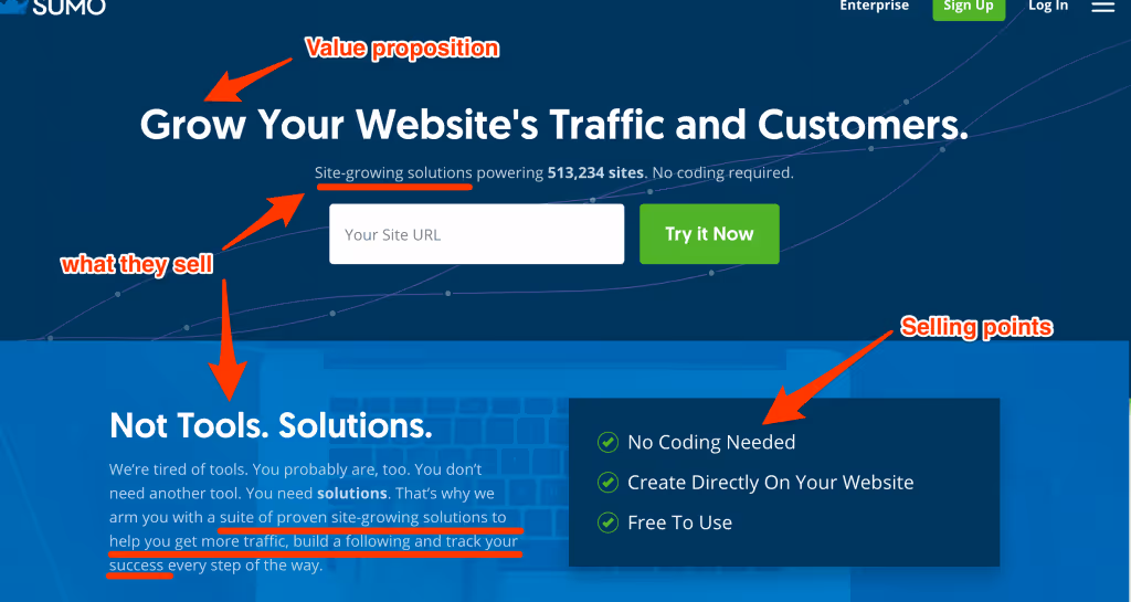
TIP: Get outside opinion for this. You know your business in-and-out so you might be biased when it comes to what you think is “simple and easily understandable”. Set the timer for 5 seconds, close the page and see if your message got across!
4. Usability
Is your website truly easy to use? Again, you might think “of course it is, duh”, but it’s the same thing, you know where everything is and visit it every day. You’re biased. You don’t want your visitors leaving because they didn’t know where things were or didn’t understand how to do something, or it was just plain annoying to do (that is also a component of a further principle, friction). In this presentation by Geoff Mackey and Greg Harron, you’ll see several examples of good vs bad Usability (or UX).
TIP: Try to do user testing and video session recording on your website.
5. Trust
People won’t click or buy if they have any anxiety, uncertainties about your website. It needs to look secure, credible, worthy of their time and money. There are 4 types of credibility, as spelled out by "BJ Fogg, Ph.D, psychology professor at Standford:
- Earned: what your visitors experienced themselves
- Presumed: what they heard about you, assumptions
- Reputed: what someone told them about you (or referenced)
- Surface: their first impression, outlook
This already gives you ideas where you can help your visitors trust you, but here are a couple of advice, you should avoid:
- Sketchy/obvious stock photos
- Weird design
- Over-the-top promises
- Unfounded statements
- Keep a close lid on what you say on social networks
- Put trust badges
- Show that security is a priority (https, etc…)
- backup your claims
- show your faces
- make it easy to contact you
- hunt down any bugs, typos
6. Friction
Friction is defined as a psychological resistance to a given element in the sales or sign-up process. Dunno about you, but I don’t find the definition particularly colorful… Here’s another way to think about it: each of your visitors has an annoy-meter, set by default on medium-high, ready to be triggered. Every little hiccup on the way brings the needle closer to high and eventually in the red—which means they’ll leave. With that in mind: Are there distractions? Blinking things, or that move automatically? Multiple CTAs on the same page? Are your processes simple and short? Are there any elements not contributing to the main purpose of your page, competing for the attention of your visitor? Amazon knows this very well, and a pretty answer… 1-Click purchase. They removed all the next steps.

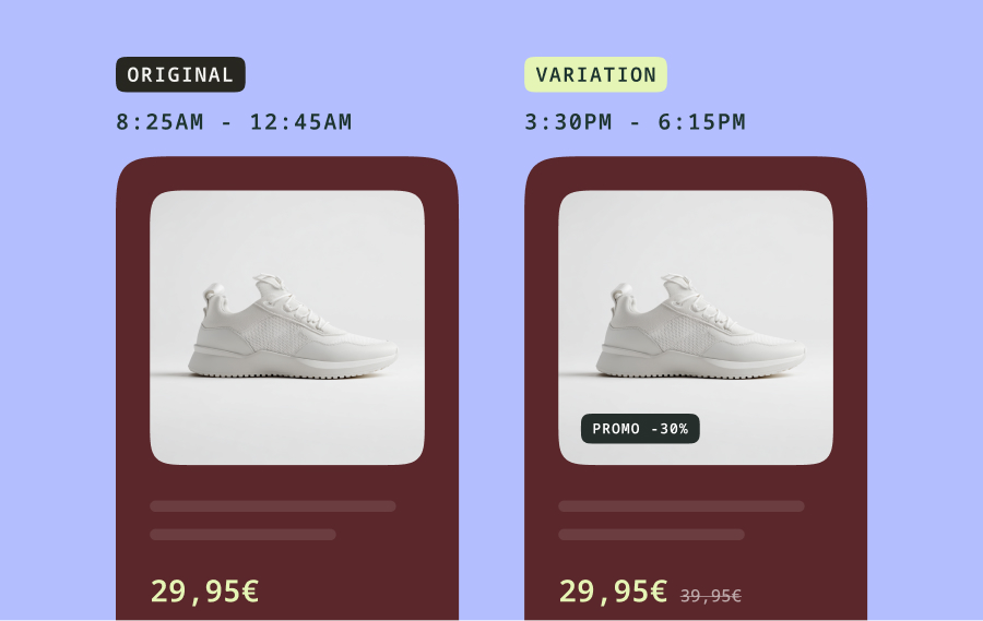
7. Scarcity
In the fundamental economic’s theory, scarcity basically means the less there is of something, the more it’s valuable. It’s also a powerful psychological tool to lean on conversions. Whether it’s in the wording (“Don’t miss your chance…”), or by displaying the remaining number of items, or with a countdown, playing with scarcity is a strong lever. But be careful with that, if you’re lying and they find out, that is trust you worked hard to earn vanishing instantly. Here is another example from Amazon, see the “deal of the day" AND a countdown.

8. Retention / Reengagement
Getting your visitors to convert once is already an achievement, but having them come back to convert again is just as crucial. Or maybe they put something in their cart and left. Do you assume they’ll come back and convert on their own, maybe pray a little? Or do you send them nice little email reminders? Here is an email reminder example from Ugmonk, a clothing e-commerce website:

Your customers (or potential customers) need to be on your website to convert, so create retention loops to bring them back if they leave without converting, or to encourage them to convert more. Your customers are visitors who decided they trusted you and your products enough to give you their money, the hardest part is behind you already. They just need little nudges to come back and convert again. Don’t miss out.
Now it’s your turn
There you have it, folks, you know all the underlying principles to optimize your conversion funnel and website.
Keep asking yourself these questions, and watch your bank account grow:
- Is it easy to use?
- Is it stupid-easy to understand?
- Is it clear what visitors need to do?
- Is it clear what’s going to happen if they click?
- Does it look trustworthy?
- Is it annoying to use?
- Are there distractions I can remove?
- Is it pertinent for me to use scarcity?
- Is the content relevant to the visitor and what he expects to find on this page?
- How can I keep their attention?
- How can I make them come back?
You should have a whole list of ideas now, so what you need to do is to experiment. Pull out your A/B testing tool, and see what works with your visitors!