What is an example of an A/B test? 10 real examples and their results

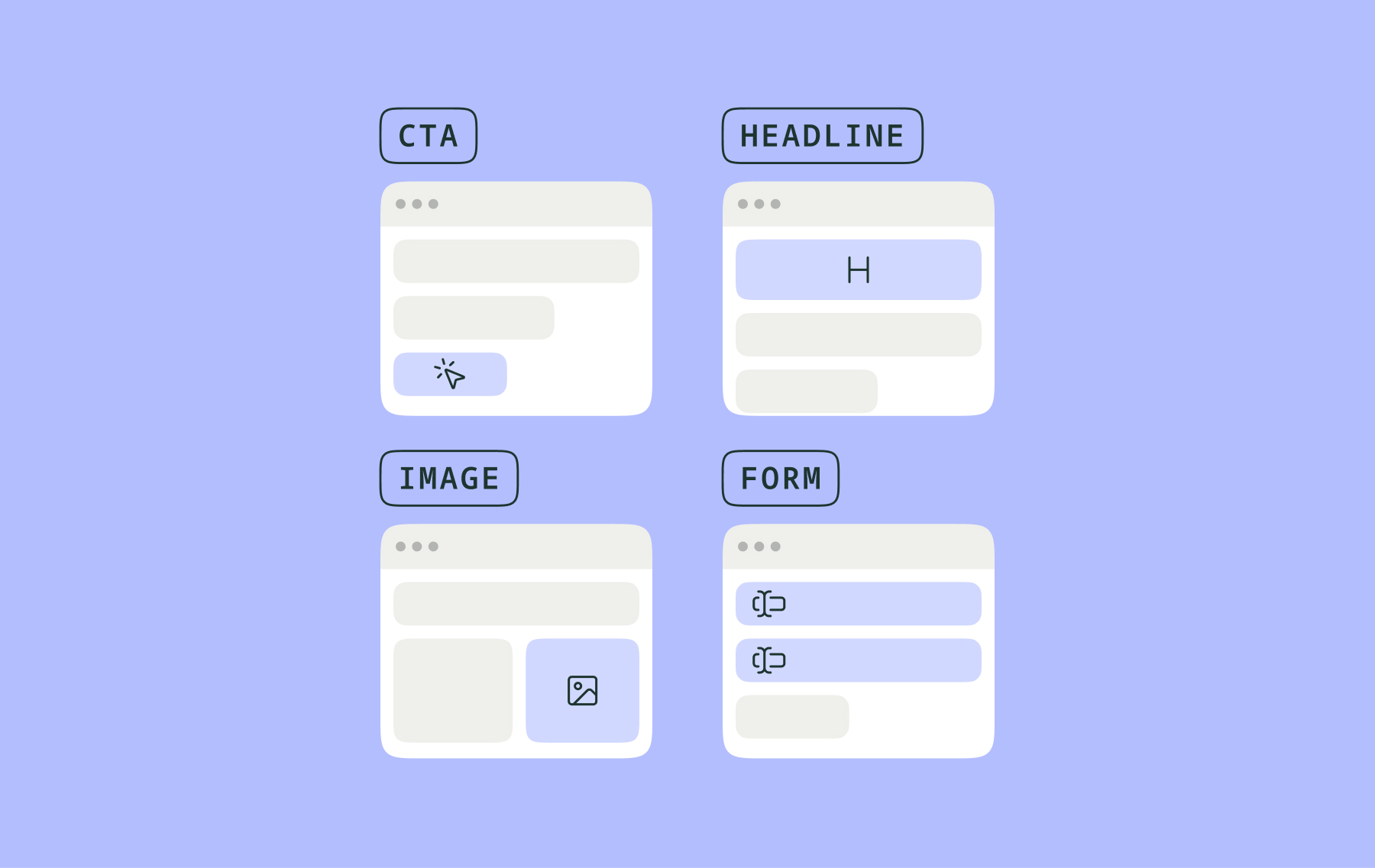
A common example of an A/B test: an e-commerce store shows half of its mobile shoppers a standard add-to-cart button, and the other half a sticky version of the same button that remains visible as they scroll. The winning variation, of course, is the version that gets more shoppers to add items to their cart.
It’s a typical test, but one with real potential: when No Two Houses ran this test, their add-to-cart rate increased by 58%.
That’s the main idea behind A/B testing: split your traffic at random between two versions of the same experience. Then, measure a primary metric for both versions or variations, and keep the version that your data supports.
Below, we’re sharing ten real A/B test examples we’ve seen from teams experimenting using Kameleoon. We’ll share what changed, what happened, and you could replicate the test yourself using Kameleoon’s Prompt-Based Experimentation (PBX).
What is an A/B test?
An A/B test is a way to compare two or more versions of a page or experience to see which one works better. You can test something as simple as the color of some text or as complex as an onboarding flow. By showing half of your visitors one version of the page and the other half another, you can compare the performance of each to determine if one is more beneficial for conversions, user experience, or any other metric.
A/B tests can also be used to evaluate personalized experiences, involve multiple variables, and apply different statistical techniques to help interpret results. To learn more about what an A/B test is, you can read this article.
What can you test with an A/B test?
There are many things you can test with an A/B test based on two broad categories: client-side and server-side testing. Client-side A/B tests typically run via JavaScript, which means they affect front-end variables: text, colors, shapes, forms fields, and popups, for example.
Server-side tests take place on the developer’s side, controlled through backend code, and can therefore be more complex: pricing algorithms, software features, and checkout queues.
You can A/B test nearly any aspect of your digital experience with the right tools, teams, and process.
10 real A/B test examples
Each of the following examples comes from one of Kameleoon's customer stories, allowing us to highlight the challenges, hypotheses, and wins that each example could generate. Several were even built using PBX.
Simple A/B test examples: edit what’s already there
These two tests are the kind of straightforward yet impactful experiments most marketing specialists can run. Both variations are largely the same, testing simple copy or layout changes only.
{{blue-block-1}}
A/B test examples for adding a simple element
These tests step up the difficulty slightly, requiring basic Javascript or CSS to build new elements on otherwise unchanged pages. An e-commerce specialist would have no trouble building these out via pre-made widgets; a more senior marketer could perhaps code them by hand.
{{pink-block-1}}
Challenging A/B test examples: building new behaviors
These tests involve interactive components and would require across-device testing and custom Javascript, in some cases across thousands of webpages. These require some developer input and may require a few days to create.
{{blue-block-2}}
Complex A/B test examples: change the flow or data
These tests pull content from other systems or webpages or change how multi-step flows work. This is where testing can get very complicated, and both examples would require a developer sprint to make work.
{{pink-block-2}}
{{quote}}
An example where the original won
A losing A/B test still returns a useful result by stopping you from shipping a change that might have cost conversions.
The Alberta Motor Association, for example, tested a new call-to-action button against its original. When the original won, the team knew not to release the change.
The same team then tested a change to its membership comparison page and found a variation that improved conversions by 10%.
So one test found a win and another prevented a loss. In both examples, the tests were worth the time committed to them.
{{quote1}}
{{cta-block}}
From example to live test with PBX
Every A/B test example you’ve read about here started with an idea that can be expressed in a plain-language sentence. With Prompt-Based Experimentation (PBX), that sentence builds the whole test, including each step from idea to the conclusion of the test:
- PBX Ideate analyzes your pages and proposes test ideas, ranked by a model trained on over 20,000 experiments.
- PBX Build turns a prompt or Figma frame into a production-ready variation, using your full site as context.
- PBX Configure sets up audiences, goals, and traffic allocation through the same chat window as PBX Build.
- PBX Ship (MCP server) lets developers pull winning variations into their IDE and ship them behind feature flags.
Want to try it yourself? Choose one example from this list, describe how it might work on your own site in a simple sentence, and try PBX for free to build the experiment in minutes.
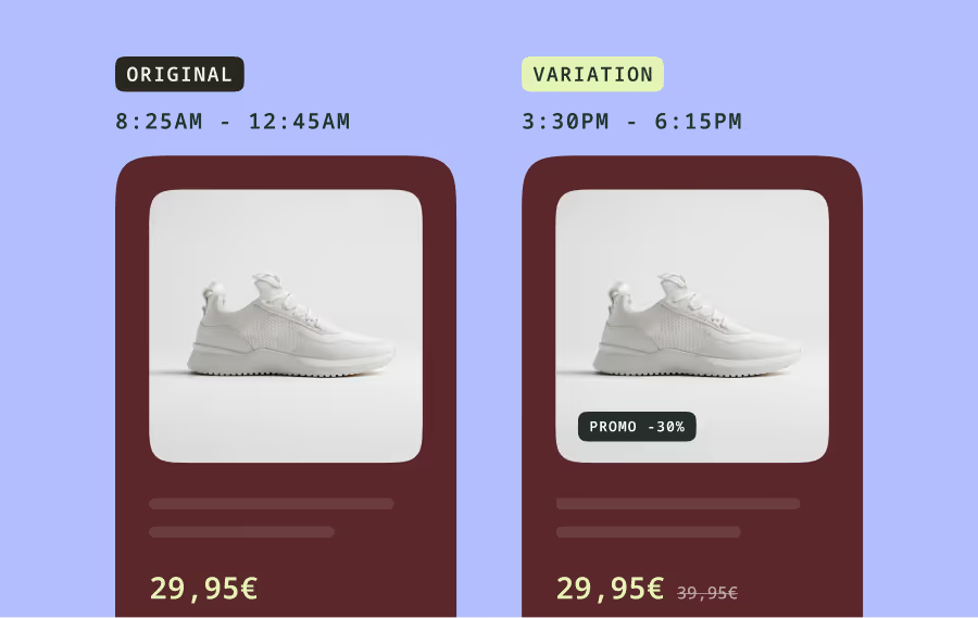
These more complex stages are also where PBX shines: even the most complex examples here take no more than a few minutes to build simply by chatting with AI.

Remember to expect more results like the CTA test than the comparison page test; across industries, fewer than 20% of experiments launched deliver positive outcomes. That’s why the ideas you choose to test matter as much as how you run them.
1. CTA copy on a product page
Who: Alternative Airlines, a global flight booking platform.
What changed: New call-to-action text for a product against its original wording, with a focus on user benefits over descriptive text.
Result: +34% purchases.
Hypothesis: CTA copy is often critical to decision-making, so small wording changes there can heavily impact how clear or worthwhile the next step feels.
2. Navigation menu reordering
Who: IKKS, a fashion brand.
What changed: The IKKS team tested a new position for their I.Code collection tab in the main navigation menu.
Result: +16.5% clicks to the collection page.
Hypothesis: Navigation order often signals priority, and items placed where the eye lands first often receive more clicks.
5. A sticky add-to-cart button on mobile
Who: No Two Houses.
What changed: On mobile product pages, No Two Houses tested the standard add-to-cart button (A) against a sticky version, remaining visible as buyers scroll (B).
Result: +58% add-to-cart rate, +13% average cart value, and +12% revenue per visit. The team rolled it out to 100% of traffic.
Hypothesis: On a long mobile product page, the button is not in view when the shopper is ready to buy. The test likely worked because keeping it on screen removes the need to scroll back up.
6. A 12-hour clock for US visitors
Who: Alternative Airlines.
What changed: US visitors saw flight times in a 12-hour format (B) rather than the default 24-hour format (A).
Result: +7% bookings.
Hypothesis: Most travelers from the US are more familiar with AM and PM than 24-hour clocks. A familiar format reduces the small but repetitive mental load of converting times while comparing flights.
7. A search bar in the page header
Who: VeryChic, a travel booking brand.
What changed: The header of the Circuits page had no search bar (A); the test variation added the homepage search bar to the page (B).
Result: +7% visits to the “request a quote” page.
Hypothesis: This likely worked because visitors who land deep in the site often want to change their searches; giving them a search bar saves them a trip to the home page, making their site journey easier.
8. A flick-through product preview
Who: Papier, a European stationery brand.
What changed: The team tested standard product browsing (A) against a flick-through preview (B) that lets shoppers see a product without extra clicks.
Result: +8% conversions.
Hypothesis: Stationery is a very visual purchase, so seeing more of the product with less effort likely boosts confidence to purchase.
3. Savings shown as an amount rather than a percentage
Who: No Two Houses, a brand from Graham & Brown.
What changed: During a sale, No Two Houses tested percentage discount badges (A) against badges showing the monetary amount saved (B).
Result: About a 2% increase during the sale period.
Hypothesis: It’s easier to judge a monetary amount than a percentage; this test likely worked because shoppers no longer needed to do the math to see their savings.
4. Trustpilot ratings on key pages
Who: Alternative Airlines.
What changed: Alternative Airlines added Trustpilot ratings to key pages (B) and compared page performance to the same pages without those ratings (A).
Result: +5% average conversions.
Hypothesis: Booking a flight through a website you’ve never used before feels risky. This test likely worked because third-party reviews lower that risk at an important moment before commitment.
9. “Skip for later” button in a signup form
Who: Winona, an online healthcare provider.
What changed: The Winona team tested the standard ID upload step (A) against the same step with a “skip for later” button (B), allowing patients to continue progressing and upload ID later.
Result: +9% increase in conversion rate within three days.
Hypothesis: This test likely worked because uploading an ID is a hard stop for anyone who doesn’t have their ID in hand already. Letting patients defer the step keeps them in the flow.
10. Technical details moved down the decision flow
Who: Samsung’s B2B online store.
What changed: On Galaxy Z Fold product pages, the team moved some technical information from the overview page into the buying section (B), where the original page (A) left it out.
Result: The case study reports +230% in average cart value for this use case.
Hypothesis: B2B buyers often check specs before they commit, so moving that information later in the process (and next to the price) answers the buyer’s key questions at the moment of purchase.
Want to learn more? Learn more about test prioritization here with PBX Ideate.
Want to learn more? Learn more about test prioritization here with PBX Ideate.