How American Airlines could improve site clarity using PBX


The American Airlines homepage and AAdvantage overview do a lot at once: surface destinations, promote loyalty offers, define program terms, and frame the booking module. Together, they compete with the action most visitors came to take.
Three small visual changes, each built from a single Kameleoon Prompt-based Experimentation (PBX) prompt, aim to shift focus back to that action. The hypothesis behind all three: when the most useful element on each page wins the eye, and when program vocabulary gets a quick in-line definition, more visitors book, browse benefits, and feel confident about joining AAdvantage.
Why these changes are worth running
None of the three variations touches the existing copy or commissions new creative. Each one comes from a single PBX prompt, is built without developer input, and keeps the design team in the experiment.
Three PBX tests for aa.com
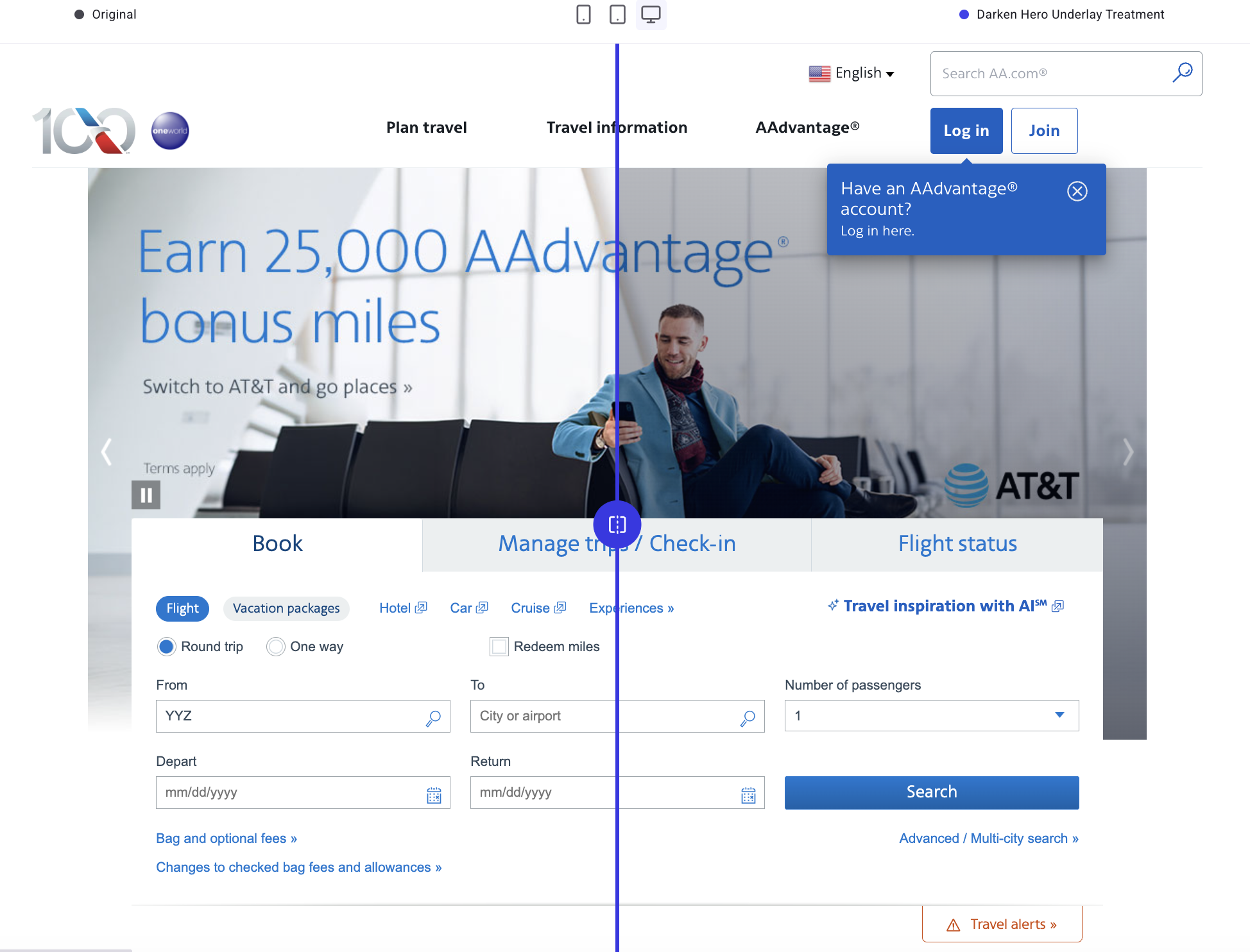
A darker hero lets the booking module lead
The homepage hero dominates the top fold. A semi-transparent dark overlay turns the photography into a backdrop, so the booking module reads as the first thing to do.
{{blue-block-1}}
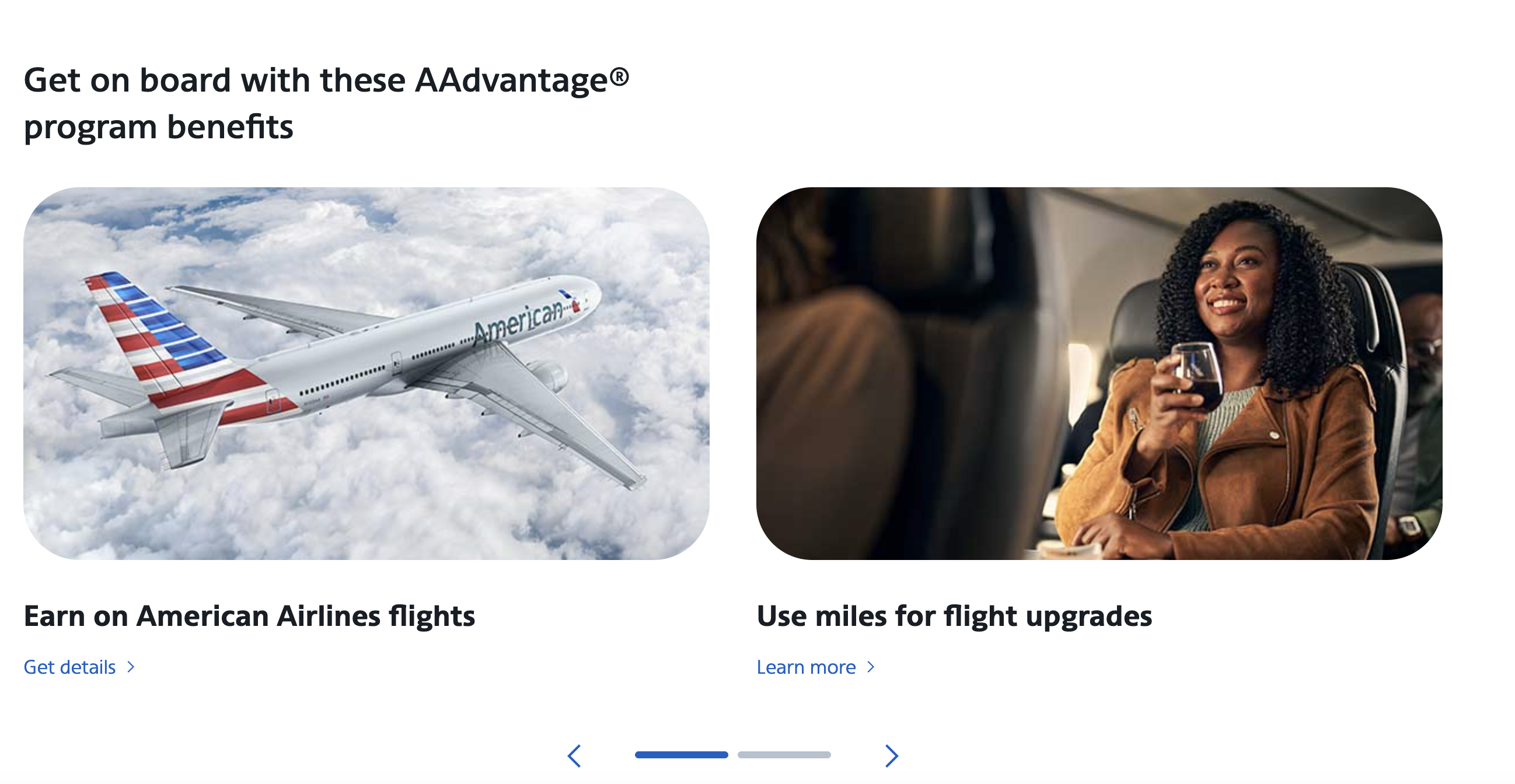
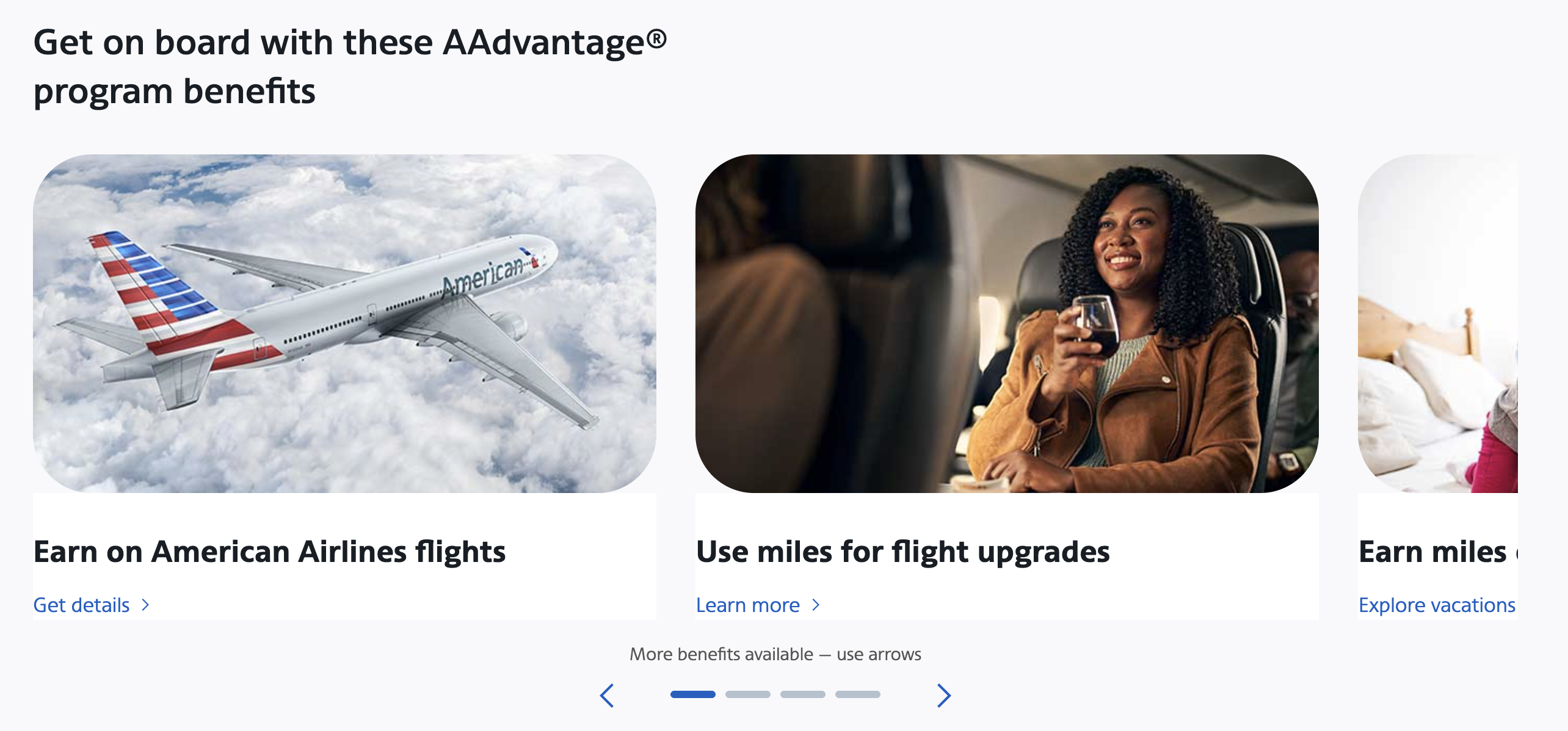
A carousel that hints at more benefits
The AAdvantage benefits carousel looks complete at a glance, so visitors may never see the next slide. The variation widens the viewport so the next card peeks past the right edge.
{{pink-block-1}}
Before:
After:
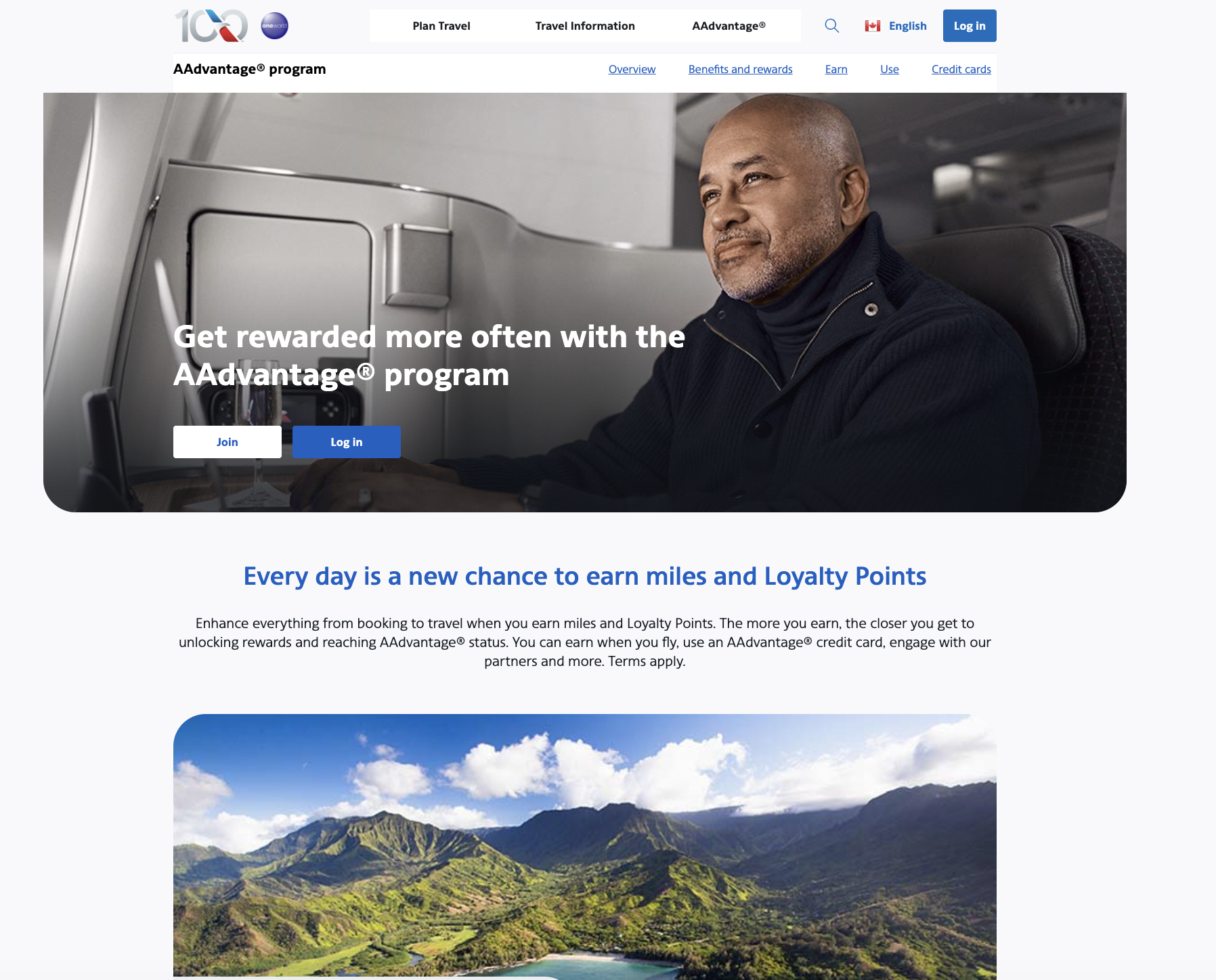
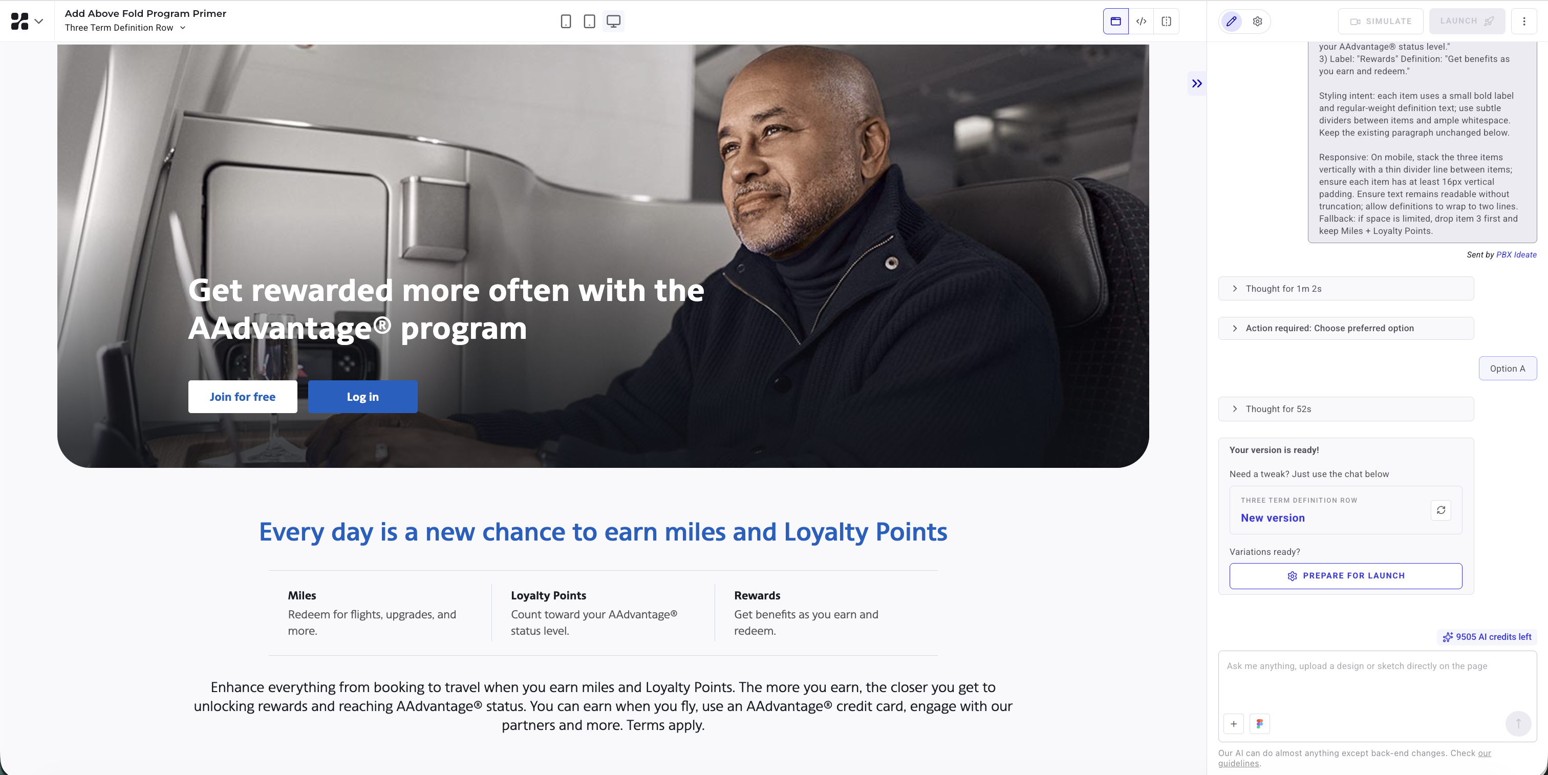
A definitions module turns jargon into benefits
Miles, Loyalty Points, and rewards appear inside one paragraph on the AAdvantage overview. The variation inserts a three-item module above that paragraph, with each term paired to a one-sentence outcome.
{{blue-block-2}}
Before:
After:
Trying PBX on your own site
Prompt-based Experimentation suits this kind of work: a clear hypothesis, a page element carrying too much visual gravity (or too little explanation), and a change small enough to ship without a sprint.
{{cta-block}}


Within the hero container, apply a semi-transparent dark overlay across the entire hero image area (including where the carousel controls appear) so the background photo becomes a supporting backdrop rather than the primary focal element.
Keep the hero headline and supporting link text readable by maintaining their current color family but increasing contrast against the darkened image (e.g., deepen the headline blue slightly and ensure the smaller line remains clearly legible).
Do not change copy in this variation. Maintain existing carousel navigation and pause controls, but reduce their visual prominence by using a lighter-weight icon style and lowering contrast relative to the new overlay. Ensure the booking module remains visually “on top” of the hero (no overlap regressions).
On mobile, keep the same overlay approach and ensure hero text and controls do not crowd the booking module; the booking module should appear immediately after the hero text with clear separation. If the overlay makes the hero image feel too flat, allow a subtle gradient that is darkest behind the booking module overlap area and lighter toward the far edge of the hero.
Within the Earning Intro Block, insert a new horizontal module directly below the blue headline and above the existing paragraph. The module contains three equal-width items (desktop) with a short label and one-sentence definition:
1) Label: “Miles” Definition: “Redeem for flights, upgrades, and more.”
2) Label: “Loyalty Points” Definition: “Count toward your AAdvantage® status level.”
3) Label: “Rewards” Definition: “Get benefits as you earn and redeem.”
Styling intent: each item uses a small bold label and regular-weight definition text; use subtle dividers between items and ample whitespace. Keep the existing paragraph unchanged below.
Responsive: On mobile, stack the three items vertically with a thin divider line between items; ensure each item has at least 16px vertical padding. Ensure text remains readable without truncation; allow definitions to wrap to two lines.
Fallback: if space is limited, drop item 3 first and keep Miles + Loyalty Points.
In the Benefits Carousel Tiles section, adjust the carousel viewport so that the next slide is partially visible on the right edge (desktop and mobile), showing at least 20% of the upcoming card. Keep arrows visible and move the progress indicator closer to the cards.
Add a small line of helper text directly above the indicator: “More benefits available — use arrows” (exact).
Responsive: On mobile, ensure the partial card preview remains visible without reducing the primary card below readable width; allow horizontal overflow with a clear peek. On desktop, maintain two full cards plus a partial third preview if space permits.
Fallback: if partial preview is not feasible, add a right-edge gradient fade and a chevron overlay indicating more content.
Try PBX on your own site
Write a prompt against your own homepage, preview the variation, and ship the A/B test the same afternoon.
Try PBX on your own site
Write a prompt against your own homepage, preview the variation, and ship the A/B test the same afternoon.