How Bank of America could improve site navigation using PBX


Bank of America's business pages give visitors plenty of information, through a grid of products on one page, a list of cards on another, and a carousel of offers on a third.
Each layout asks the same quiet question: which option is right for me? The longer that takes to answer, the more visitors stall before acting.
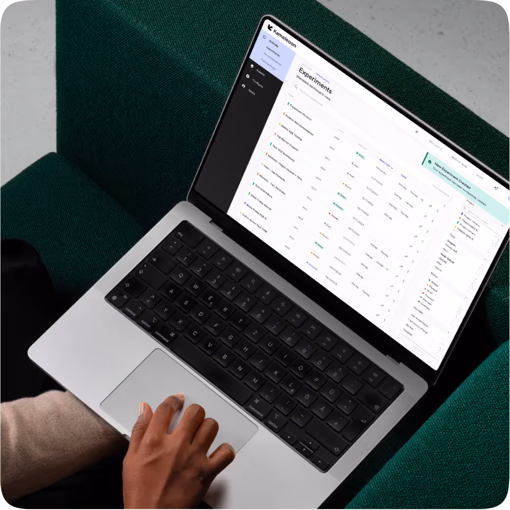
Kameleoon's Prompt-Based Experimentation (PBX) makes that friction easy to test. We used PBX Ideate to surface three ideas worth trying to improve site navigation on the Bank of America website. Then, we used PBX Build to turn each of our plain-English prompts into a brand-aligned variation ready to run against the original, with no engineering ticket required.
The hypothesis behind all three tests below is the same: make the next step clearer and the options easier to compare, and more visitors move from browsing to acting.
Less effort, more action
The thinking behind each test is simple: visitors are likely to stall when comparing options feels like work.
Each test below removes a piece of that work, adding a clearer primary path, a scannable summary, and more choices in view at once respectively.
None of them touch the brand. The logos, colors, and product photography stay where they are. PBX even handles the responsive rules, so the mobile layout holds up.
Finally, because these are hypotheses, each test names the metric it should move and the risk it could carry.
Three tests with three clearer paths
Here is what each variation changes, why it could help, what we would measure, the risk we would watch, and the plain-English prompt that built it.
Test 1 (businesses page): A single, obvious next step
The "I'm interested in" module offers tabs and a grid of cards, but no clear lead. The variation adds one prominent button above the choices, so an undecided visitor gets a clear default instead of weighing every card. That lowers the effort to start and makes the full range easier to discover.


{{blue-block-1}}
We would measure click-through on the new button, and the share of visitors who then reach a product or application page. The trade-off to watch: a dominant button can pull attention away from the individual cards, so card engagement could dip.
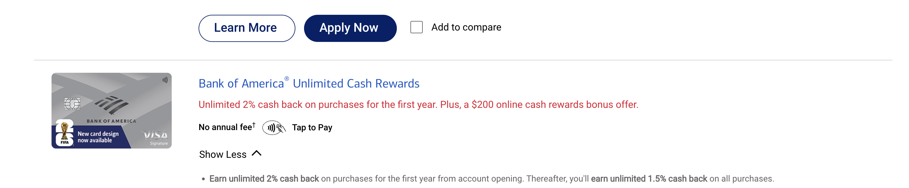
Test 2 (products page): Differences you can scan in seconds
Each cash back card keeps its key terms inside paragraphs of copy. The variation adds an "at a glance" strip with three columns, so visitors can compare rewards, intro offer, and annual fee without digging through the fine print. Faster comparison simplifies the decision and surfaces the differences that drive a choice.

{{pink-block-2}}
We would measure card selection and "Apply Now" clicks, through to completed applications. The trade-off to watch: a summary can oversimplify, so some visitors may apply before reading the full terms.
Test 3 (businesses page): More options, no clicks required
The product promotion section hides its offers behind a carousel. The variation shows three offers at once, each with an image, a one-line value statement, and its own button, so visitors can take in every option without touching an arrow. Exposing all three widens discovery and lets visitors self-select the path that fits best for them.


{{blue-block-2}}
We would measure total CTA clicks across the three tiles and how attention spreads between them, plus downstream applications. The trade-off to watch: three offers at once can split attention, where a single featured offer would concentrate it.
Built directly into your site
Mockups can only demonstrate ideas, and those ideas still need to be designed, built, and shipped before visitors can see them.
PBX closes that gap. It reads your live site, writes each variation as production-ready code, and runs it against your live traffic. The experiment lives where your customers already are, allowing you to learn from every idea, never held back by backlogs and priorities.
{{cta-block}}


The prompt
At the top-right of the "I'm interested in" module, add a primary filled blue button labeled "Browse All Business Solutions". Place it above the card grid, larger than the individual card CTAs. Keep the existing card CTAs, but reduce their prominence with an outline style.
The prompt
Within the product promotion section, replace the carousel with three static offer tiles in a single row on desktop. Each tile gets a product image, a name, a one-sentence value line, and a filled blue CTA: "Apply For Cash Rewards", "Explore Business Checking", and "Find Payment Solutions". Remove the arrow and dot controls entirely.
Built directly into your site
Mockups can only demonstrate ideas, and those ideas still need to be designed, built, and shipped before visitors can see them.
PBX closes that gap. It reads your live site, writes each variation as production-ready code, and runs it against your live traffic. The experiment lives where your customers already are, allowing you to learn from every idea, never held back by backlogs and priorities.
The prompt
Within each card entry, insert an "at a glance" strip below the product name. One row, three columns: "Rewards", "Intro Offer", and "Annual Fee". Populate each value from the existing on-page copy. Use a light neutral background with a subtle border to set it apart.
Try PBX on your own site
Every test here started as a sentence. If your team has a page you have wondered about, PBX turns the question into a live test in minutes.
Try PBX on your own site
Every test here started as a sentence. If your team has a page you have wondered about, PBX turns the question into a live test in minutes.