How Jefferson Health could improve scheduling using PBX


Jefferson Health's website gives patients many ways to reach care: four scheduling options on one page, mixed shortcut tiles on the homepage, and a long list of services on find-a-doctor.
Each layout asks the same quiet question: where do I start? The longer that takes to answer, the more patients stall before connecting with care.
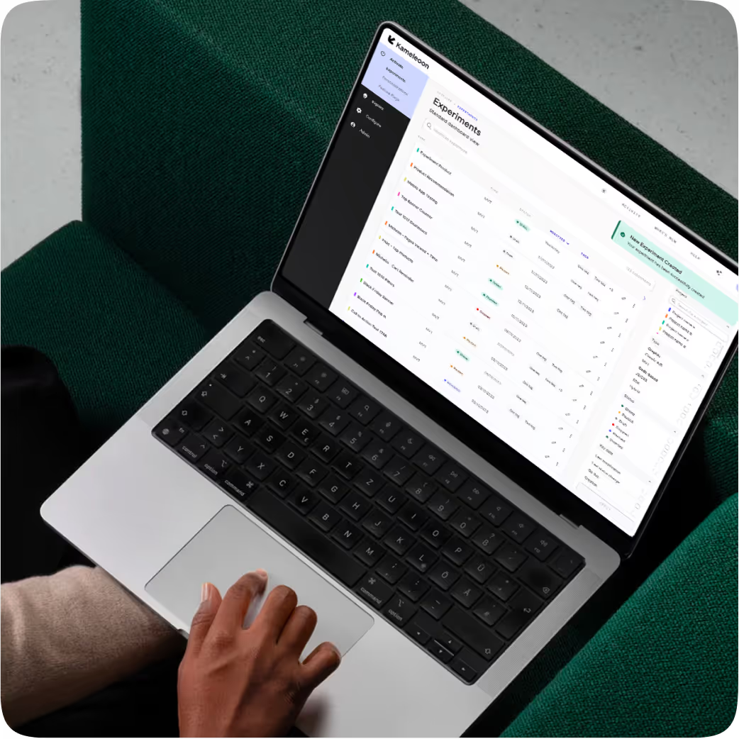
Kameleoon's Prompt-Based Experimentation (PBX) makes that friction easy to test. PBX Ideate surfaced ideas worth trying, and PBX Build turned each plain-English prompt into a brand-aligned variation, ready to run with no engineering ticket.
The hypothesis behind all three tests below is the same: give patients one clear starting point and fewer competing options, and they commit faster with less comparison effort.
Fewer choices, faster starts
Patients stall when choosing how to get care feels like work. These tests are designed to remove a piece of that work with a guided starting point, sharper task grouping, or a live search.
None touch the brand: Jefferson's colors, type, and photography remain, and PBX handles the responsive rules so the mobile layout holds up.
{{pink-block-1}}
Three tests, three clearer starts
Here is what each variation changes, the prompt that built it, and what we would watch.
Test 1 (scheduling page): One starting point instead of four
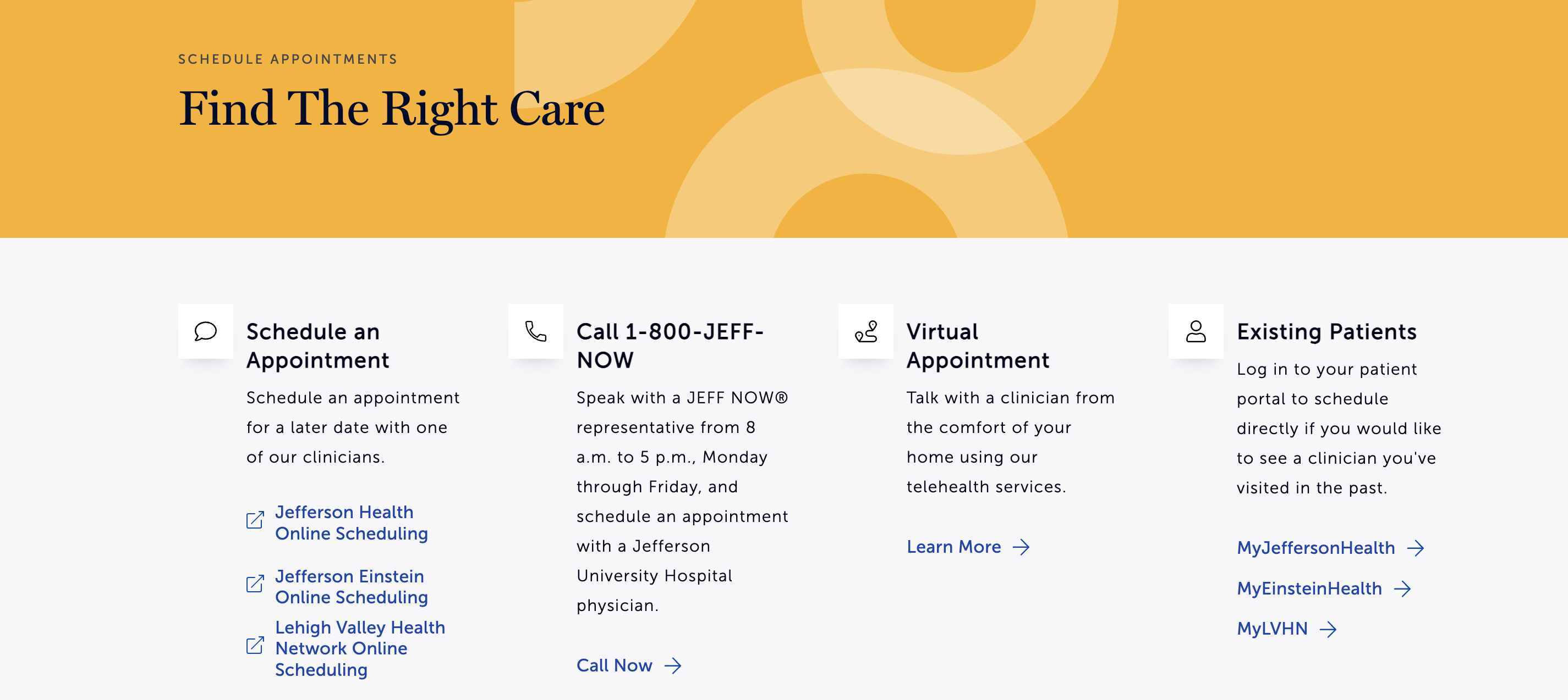
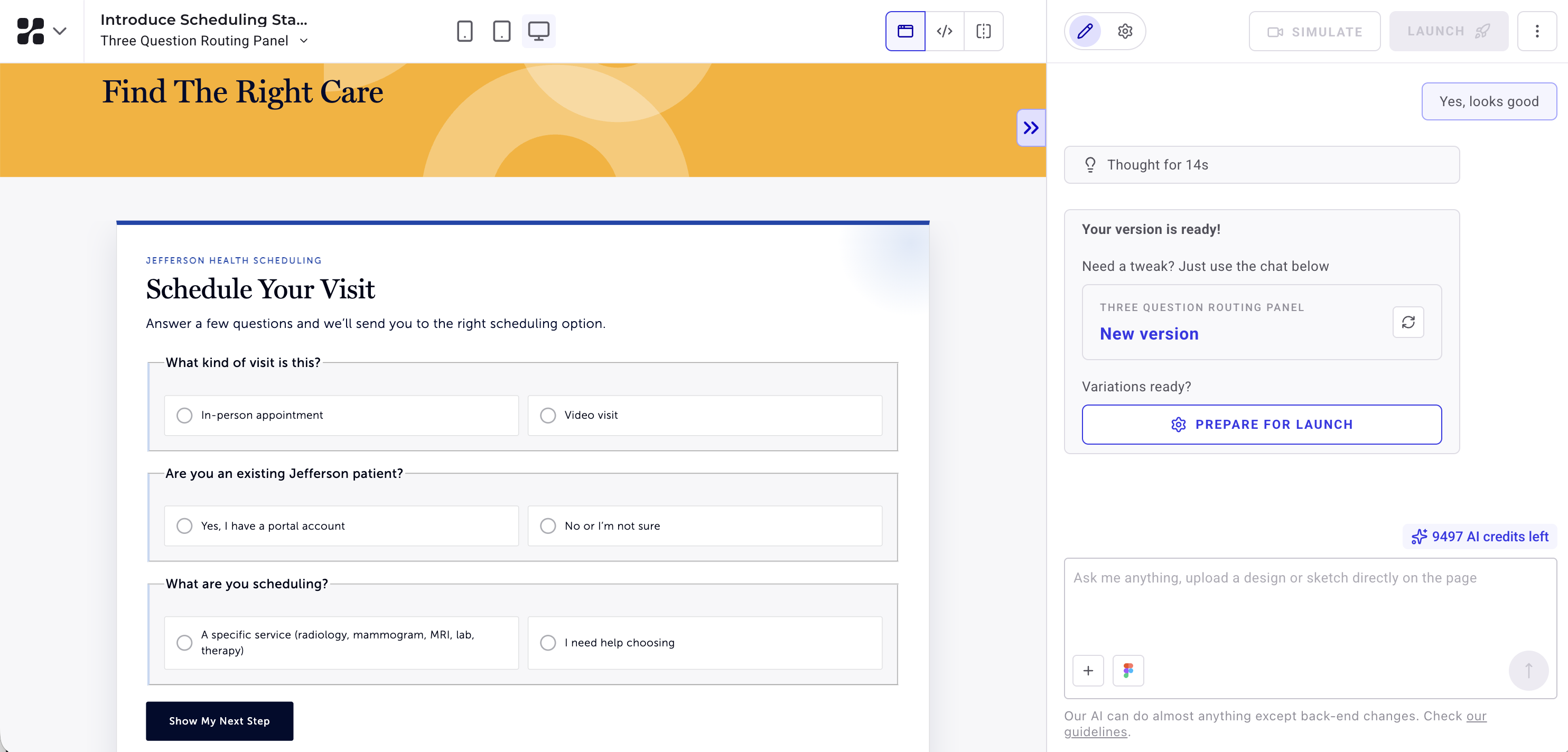
The scheduling page offers four equally weighted options: online scheduling, a phone line, virtual visits, and patient portals. The variation replaces them with one "Schedule Your Visit" panel that instead asks three questions and recommends a single next step. The theory is that an undecided patient will move faster by answering, rather than comparing.
{{blue-block-1}}
We would measure clicks on "Show My Next Step" and track how many patients reach a scheduling destination.
The risk: patients who know their route now have three questions in the way. Measure abandonment and other indications of frustration.
Test 2 (homepage): Three intents, one clear selection
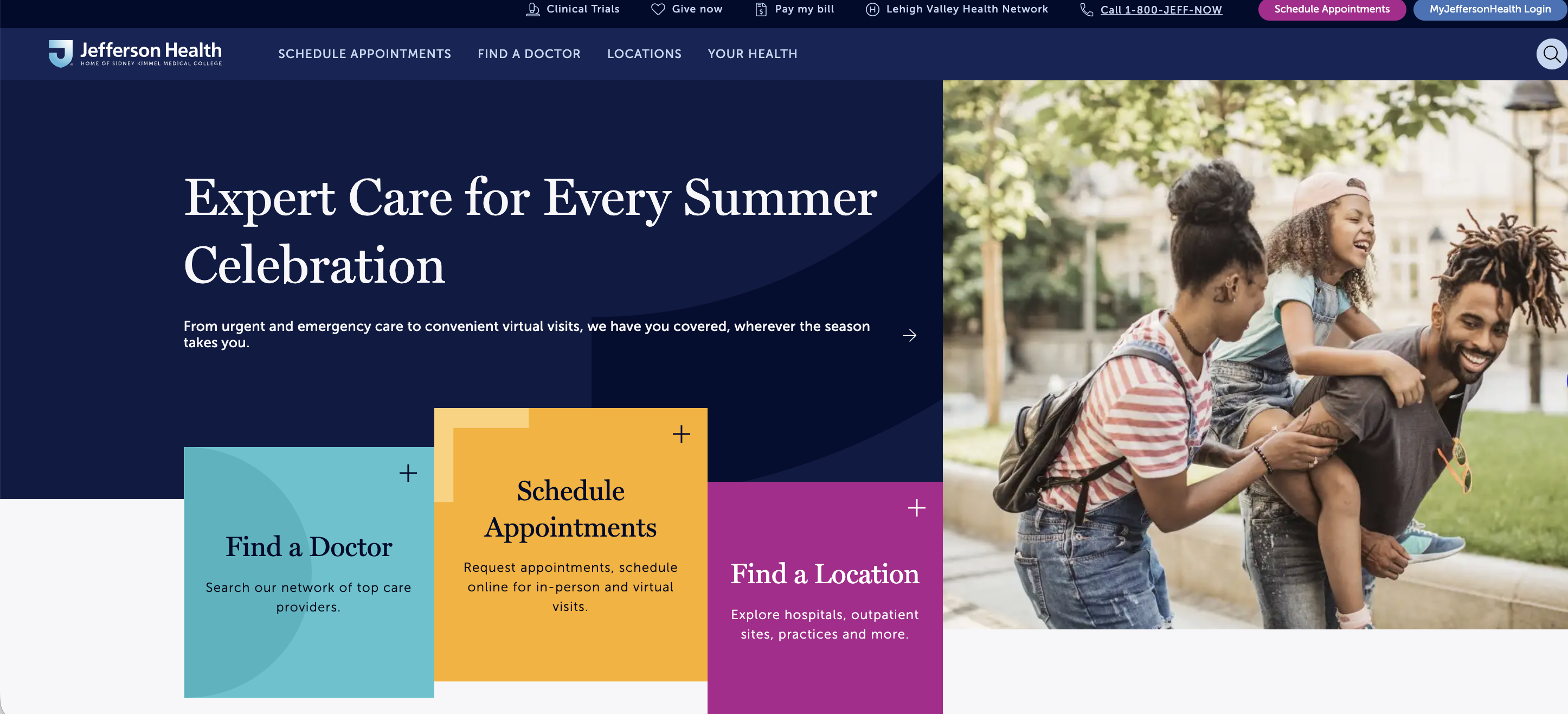
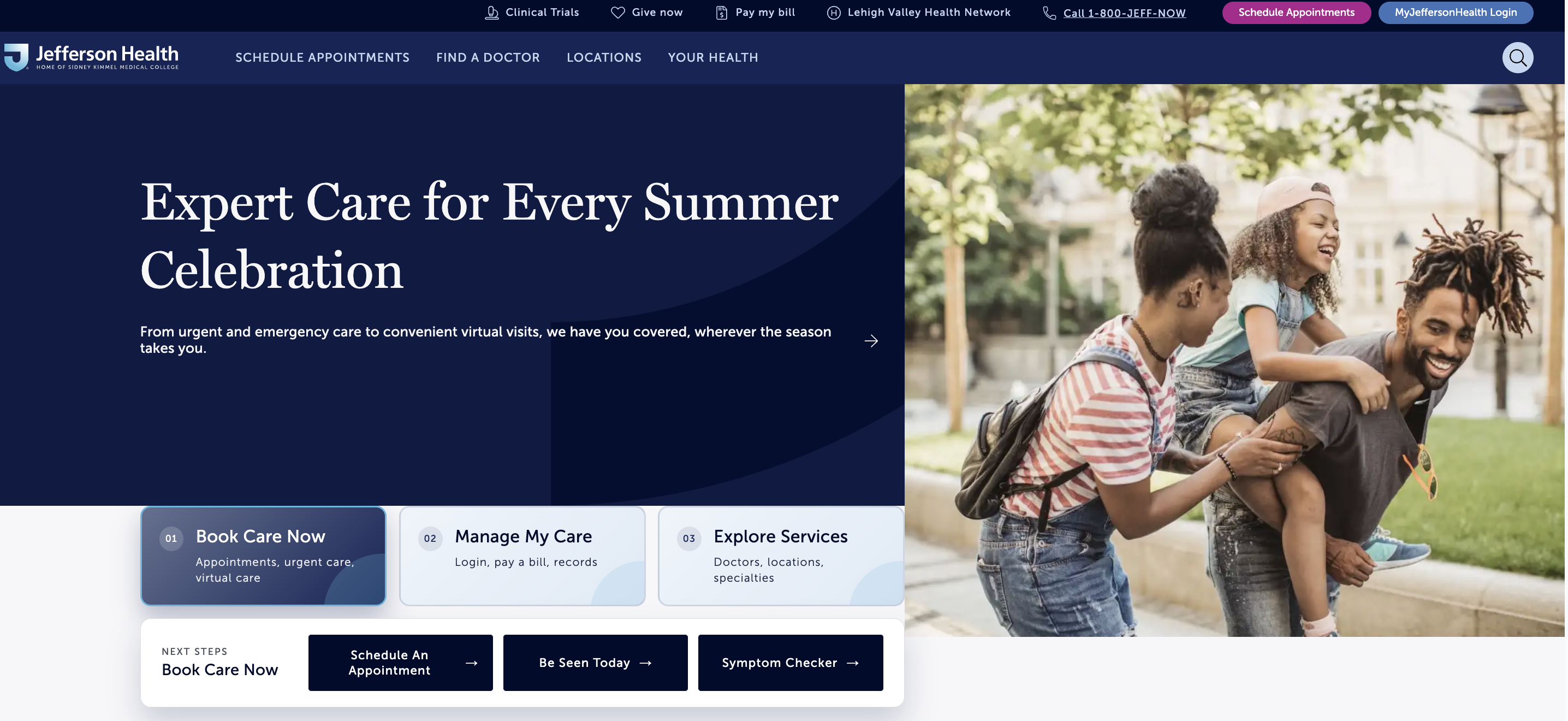
The homepage hero stacks shortcut tiles with mixed jobs. The variation groups everything under three equal tiles: "Book Care Now," "Manage My Care," and "Explore Services." Each expands in place to reveal two or three large buttons. Grouping by intent narrows the first decision to three clear jobs.
{{pink-block-2}}
We would measure tile clicks and the revealed CTAs, through to scheduling starts and portal logins.
The risk: the expansion adds a click, and returning patients may miss the shortcuts they know.
Test 3 (find-a-doctor page): A list that answers as you type
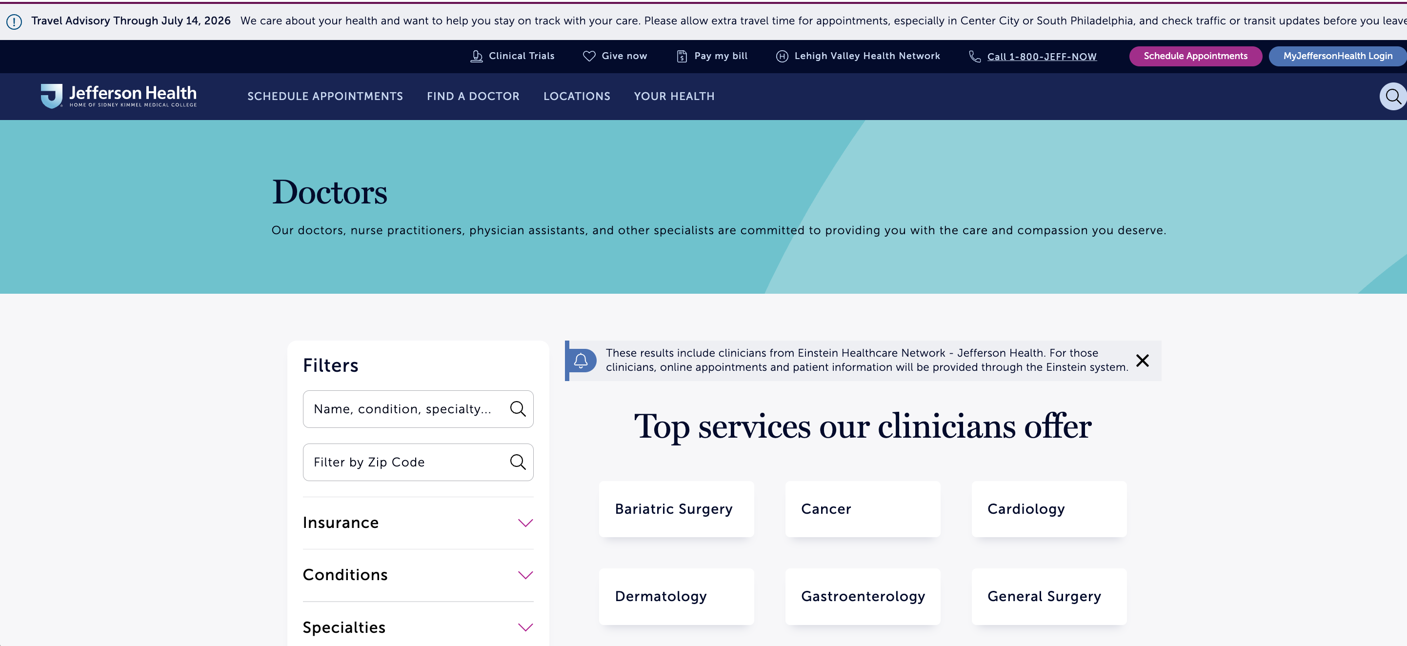
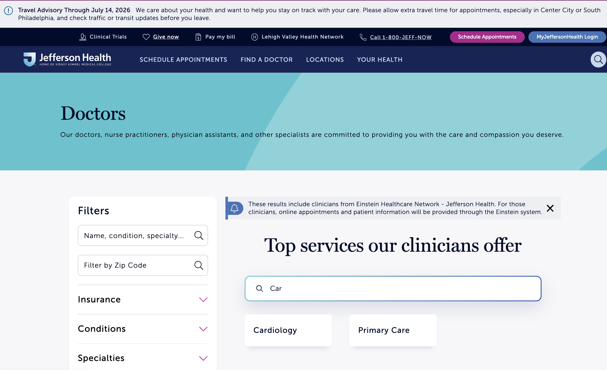
The "Top services our clinicians offer" section presents a long grid of services. The variation adds a search bar above the list; as a patient types, services that do not match disappear. Three letters cut the grid to a handful of matches, so patients set their own pace.
{{blue-block-2}}
We would measure search usage and service selection, through to provider results and appointment requests.
The risk: a term with no match leaves the list empty, so a misspelling could end a search that scanning would have finished.
Built directly into your site
Mockups only demonstrate ideas; they still need to be designed, built, and shipped before patients see them.
PBX closes that gap. It reads your live site, writes each variation as production-ready code, and runs it against your live traffic. The experiment lives where your patients already are, never held back by backlogs and priorities.
{{cta-block}}
.jpg)

The prompt:
Replace the four scheduling option cards with one full-width panel titled "Schedule Your Visit." Add three stacked radio questions: visit type, existing patient or not, and what they are scheduling. One primary button, "Show My Next Step," reveals a single recommended action card.
The prompt:
Add a searchable filter between "Top services our clinicians offer" and the list of services, with the placeholder text "Search for a service." As the user types, items that do not match the query disappear from the list.
Why these tests matter
All three tests share one goal: less work between arriving on a page and starting to book. One replaces four paths with a guided one, one groups the homepage by intent, and one cuts a long list down to an answer. Together, they shorten the path from first glance to first appointment.
The prompt:
Within the hero tile container, replace the mixed shortcut tiles with three equal-width tiles labeled "Book Care Now," "Manage My Care," and "Explore Services." Clicking a tile expands an in-place panel below it with 2–3 large button CTAs.
Every test started as a sentence. If your team has a page you have wondered about, PBX turns the question into a live test in minutes.
Every test started as a sentence. If your team has a page you have wondered about, PBX turns the question into a live test in minutes.