How American Airlines could improve booking focus using PBX


The American Airlines homepage greets every traveler with a vivid hero carousel, including destinations, promotions, and loyalty offers.
Just below it sits the booking module, the form that turns a visitor into a passenger.
Using Kameleoon's Prompt-based Experimentation (PBX), one sentence is enough to test whether that booking module deserves more visual gravity than the hero (though we used more than one for this example!).
Below, we'll walk through the hypothesis, the prompt used to build the variation, and why the change is worth running on a site as established as aa.com.
The hypothesis
The American Airlines hero currently competes with the booking module for attention. The photography is bright and the carousel controls draw the eye. Is that beneficial for the search form, or does the it recede into the page?
Adjusting the hero's visual dominance, while keeping the promotional content intact, could shift focus to the action that matters most: building an itinerary.
The working hypothesis is that if the hero image becomes a backdrop, rather than the lead element, more visitors are likely to engage the booking flow without scrolling past or scanning around the form.
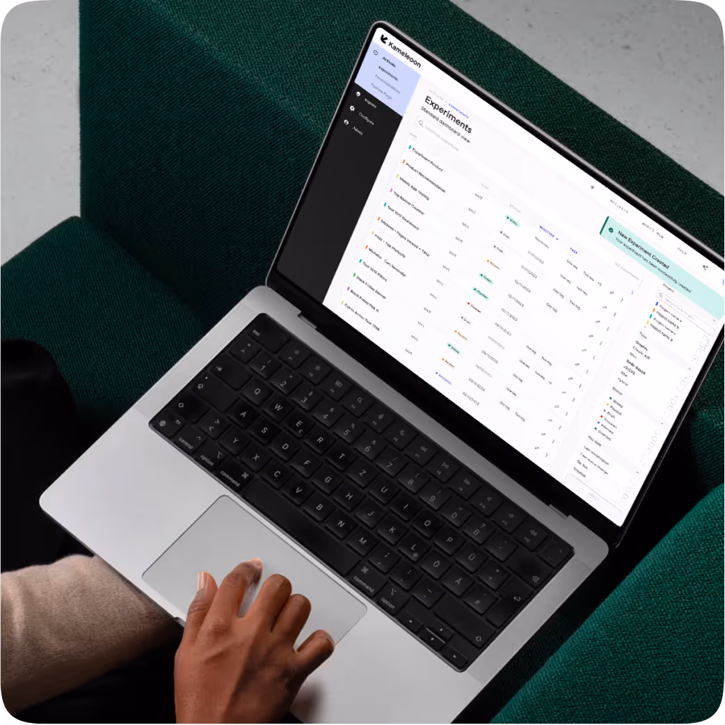
The prompt used in PBX Build
A single PBX Build prompt produces a working A/B test variation inside the Kameleoon editor. The text below is what was sent to PBX, with no manual code adjustments after the fact.
{{blue-block-1}}
The variation
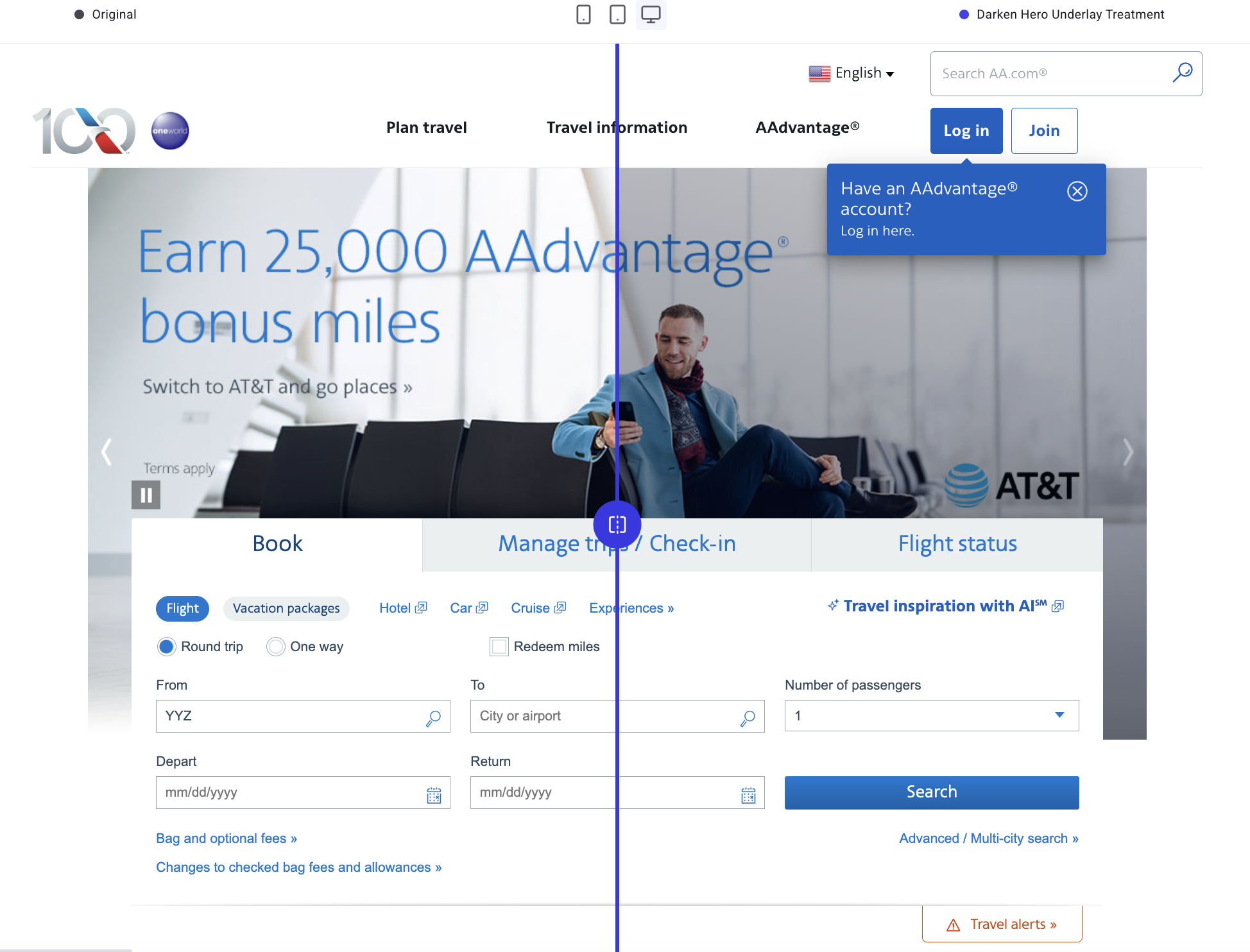
Before
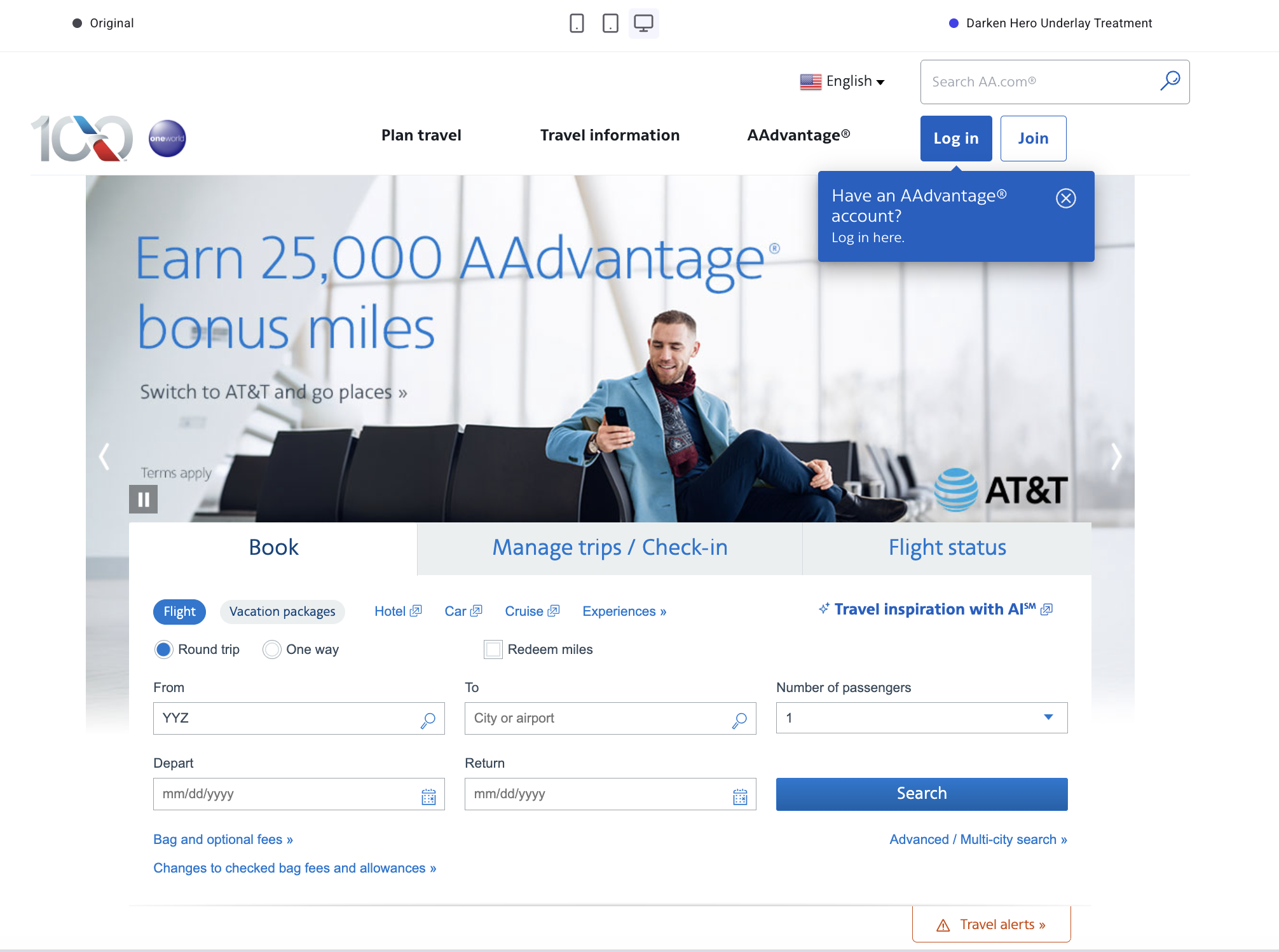
The control uses vibrant photography to fill the top fold. The headline is legible, and the booking module sits as a secondary element below.
After
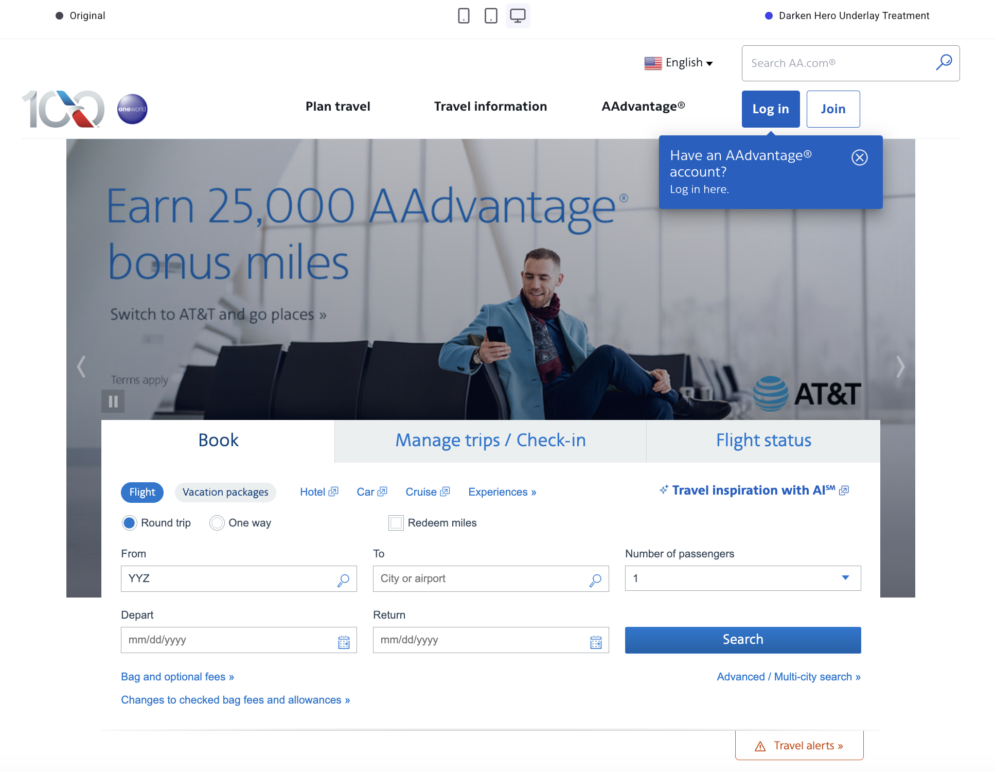
The variation contains the same hero image, same copy, and same controls with a softened backdrop. The booking module should now read as the first thing to do.
Why the change is worth testing
A clearer next step for travelers
A travel homepage carries many jobs at once: promotions, loyalty offers, editorial content, and plenty more. Reducing the visual weight of the hero sequences those jobs in a way that should make them easier to understand and act on.
The booking module becomes the obvious first action, while the carousel remains available for visitors who want to browse destinations.
No copy changes, no creative rebuild
The variation preserves every word and every image already approved for the homepage. The only difference is contrast and emphasis.
That means the test can run without commissioning new creative or routing assets through brand review.
A test that fits a busy marketing team
The whole variation came from one prompt. PBX Build produced the overlay, the headline contrast adjustment, the lighter carousel controls, and the mobile spacing without any input from a design or development team.
The design and engineering teams stay in the experiment loop, and engineering is free to work on the projects that need them.
Trying PBX on your own site
Prompt-based Experimentation is built for exactly this kind of test. A clear hypothesis, a homepage element with too much visual gravity, and a change small enough to ship without a sprint.
A free PBX trial lets any team write a prompt against their own site, preview the variation, and start the A/B test the same afternoon.
{{cta-block}}

Within the hero container, apply a semi-transparent dark overlay across the entire hero image area (including where the carousel controls appear) so the background photo becomes a supporting backdrop rather than the primary focal element.
Keep the hero headline and supporting link text readable by maintaining their current color family but increasing contrast against the darkened image (e.g., deepen the headline blue slightly and ensure the smaller line remains clearly legible).
Do not change copy in this variation. Maintain existing carousel navigation and pause controls, but reduce their visual prominence by using a lighter-weight icon style and lowering contrast relative to the new overlay. Ensure the booking module remains visually “on top” of the hero (no overlap regressions).
On mobile, keep the same overlay approach and ensure hero text and controls do not crowd the booking module; the booking module should appear immediately after the hero text with clear separation. If the overlay makes the hero image feel too flat, allow a subtle gradient that is darkest behind the booking module overlap area and lighter toward the far edge of the hero.
Try PBX on your own site
Start a free PBX trial and ship your first prompt-built A/B test the same afternoon.
Try PBX on your own site
Start a free PBX trial and ship your first prompt-built A/B test the same afternoon.