How Verizon could improve plan selection using PBX


Verizon leads with one word: simple.
Its consumer homepage, business hub, and Simplicity Plan page all open with a bold promise, then ask the same quiet question: which path is yours? The longer that decision takes, the more visitors are likely to stall.
Kameleoon's Prompt-Based Experimentation (PBX) makes these moments of friction easy to test. We used PBX Ideate to surface three ideas for the Verizon site, then PBX Build to turn each plain-English prompt into a brand-aligned variation, ready to run against the original with no engineering ticket.
The hypothesis behind all three is the same: name the offer and the next step clearly, and more visitors move from reading to choosing.
This is what the process looks like, from Ideate to Build right up to the Configure step:
We've sped up the video during loading screens; the full process took about four minutes.
Why these tests matter
{{pink-block-1}}
Each test names the metric it should move and the trade-off it could carry. The goal is to learn what visitors actually do and build off the knowledge.
Three tests, three clearer paths
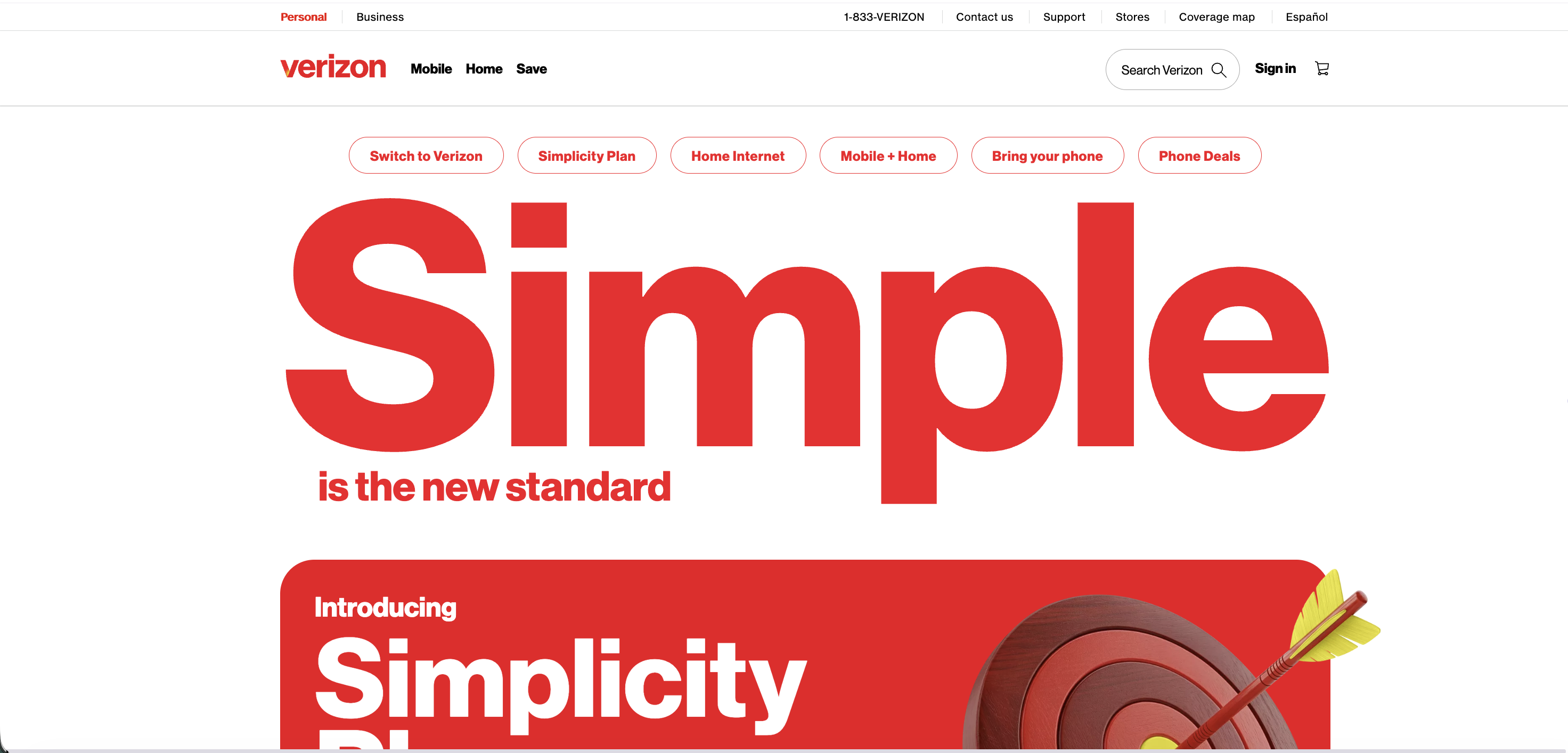
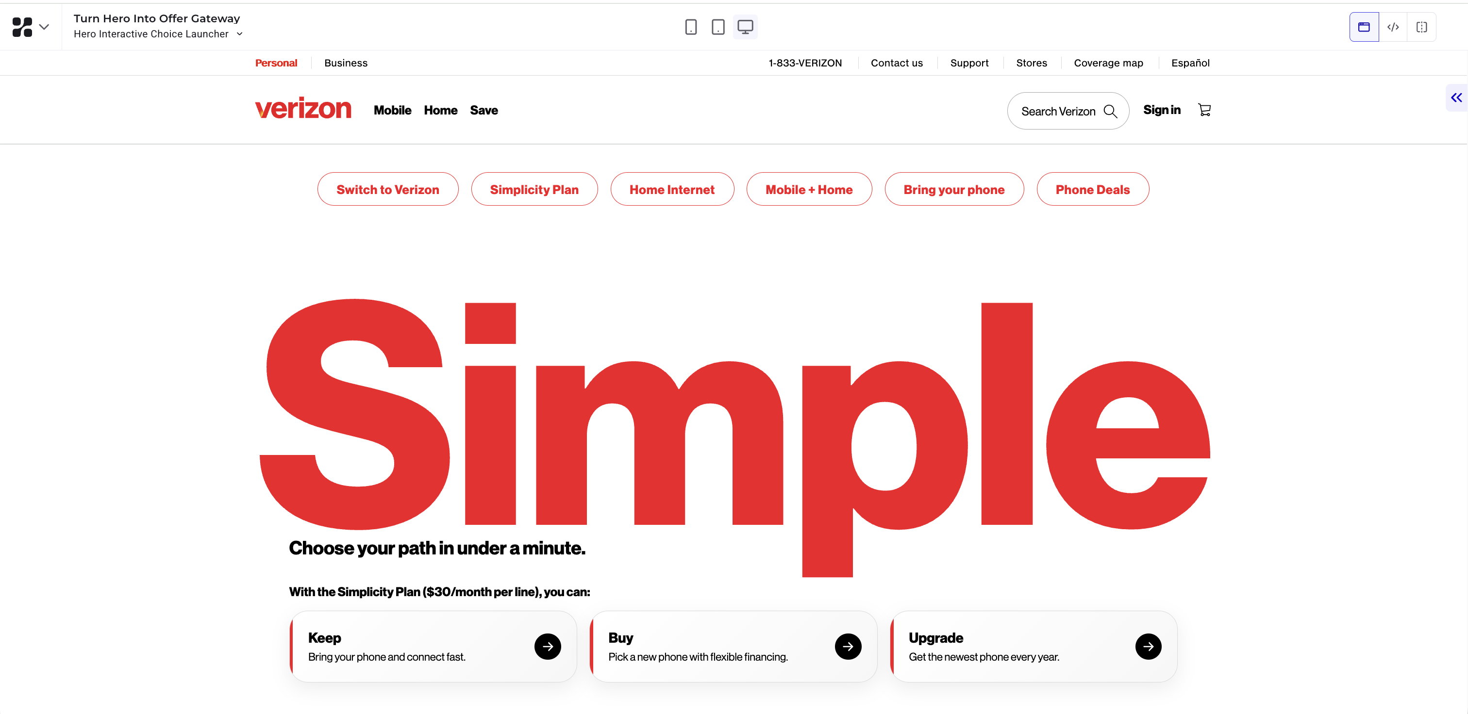
Test 1 (homepage): Three paths, one glance
The hero makes a bold promise but leaves the next move open. The variation keeps the "Simple" headline, swaps the supporting line for "Choose your path in under a minute," and adds three choice chips: Keep, Buy, and Upgrade. Each scrolls the visitor straight to the matching section.
We would measure chip clicks and the share of visitors who then reach a plan section. The trade-off to watch: a chooser this prominent could pull attention from the introductory banner below it.
{{blue-block-1}}
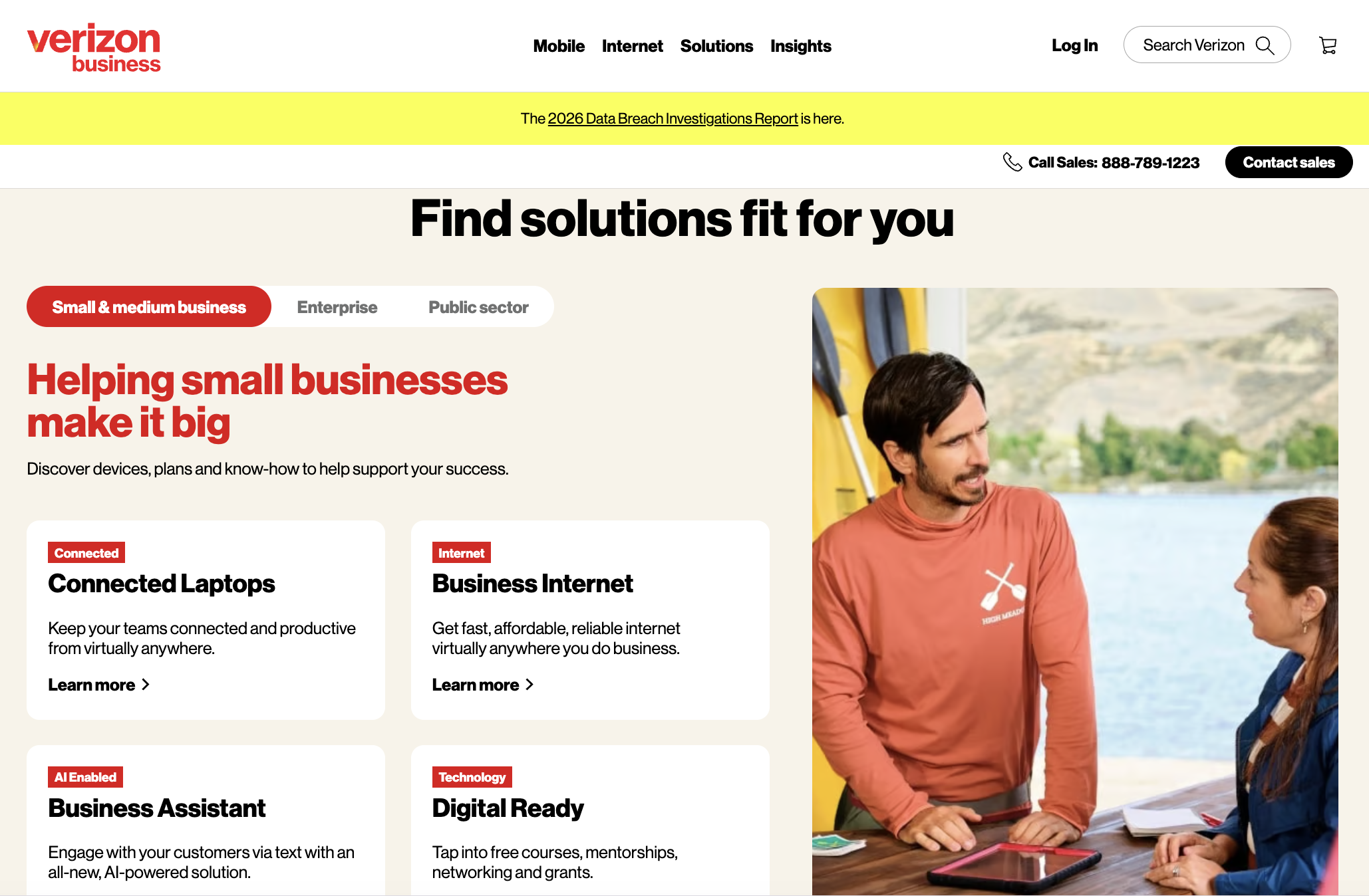
Test 2 (business page): Start from the goal, not the grid
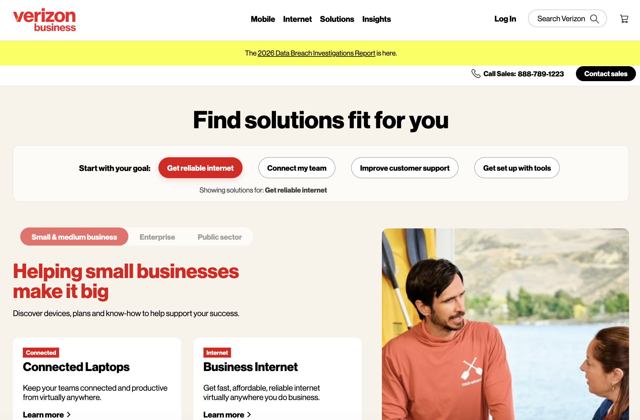
The solutions block on the business page asks visitors to sort themselves by segment first, assuming they know which label fits. This variation adds a goal picker above the tabs: Get reliable internet, Connect my team, Improve customer support, and Get set up with tools. Choosing a goal reorders the cards so the most relevant two lead.
We would measure goal selections and clicks into the reordered cards, through to a contact request. The trade-off to watch: filtering could push a card a visitor wanted further down the grid.
{{pink-block-2}}
Test 3 (unlimited plan page): The plan's value, up front
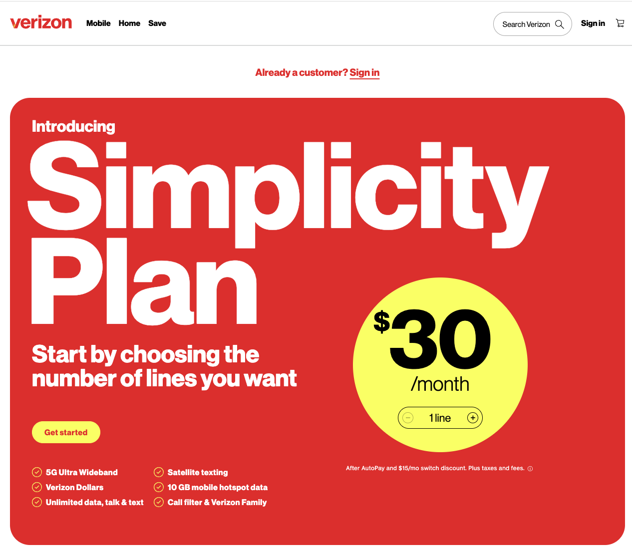
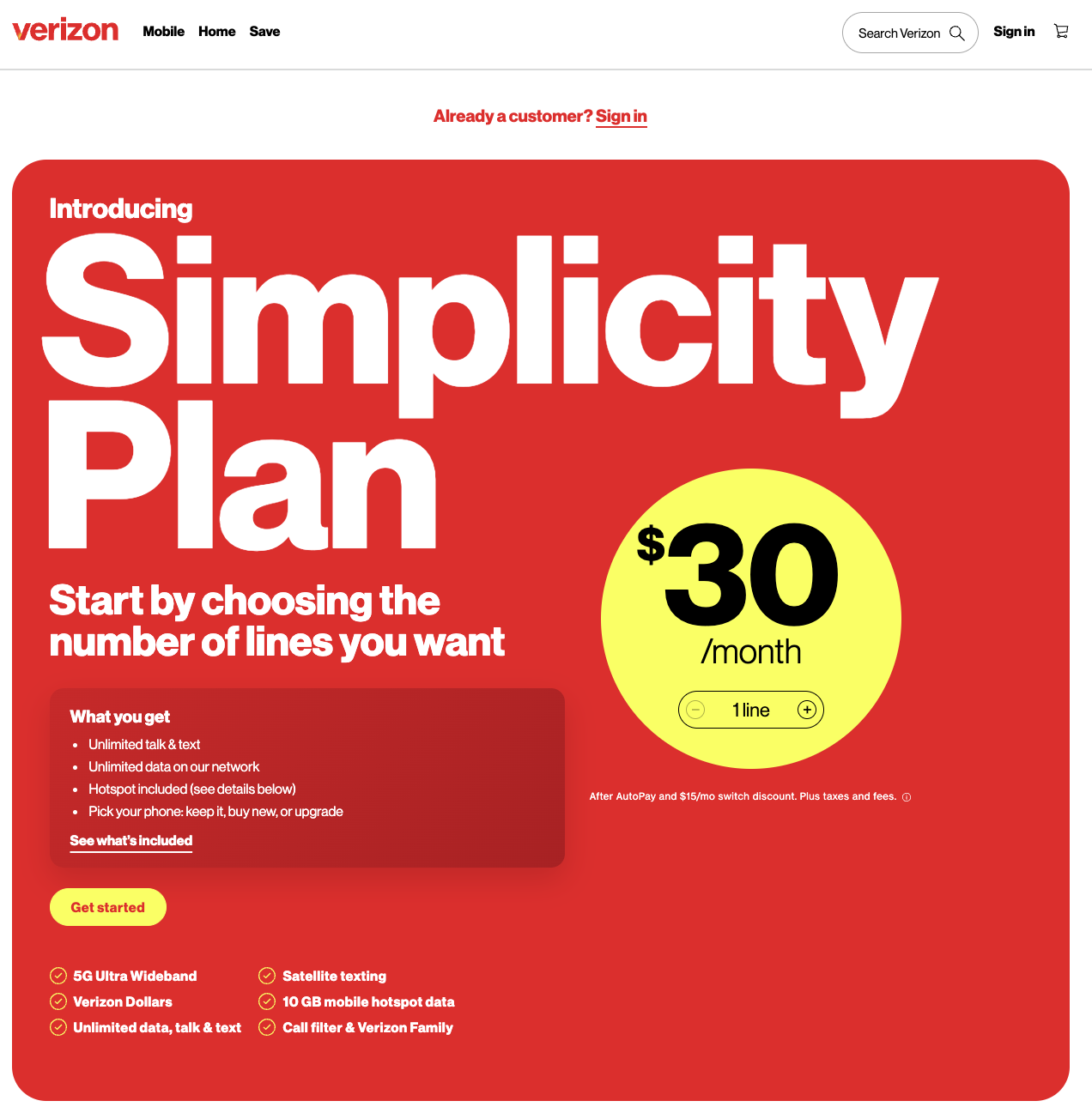
The Simplicity Plan hero sells a feeling before it lists a single benefit. The variation adds a "What you get" panel under the headline: unlimited talk and text, unlimited data, hotspot included, and a choice to keep, buy, or upgrade a phone. A "See what's included" link anchors to the details.
We would measure "Get started" and "See what's included" clicks, through to line selection. The trade-off to watch: a short summary could set expectations before a visitor reads the terms.
{{blue-block-2}}
Built directly into your site
A mockup only shows an idea. It still has to be designed, built, and shipped before a visitor ever sees it.
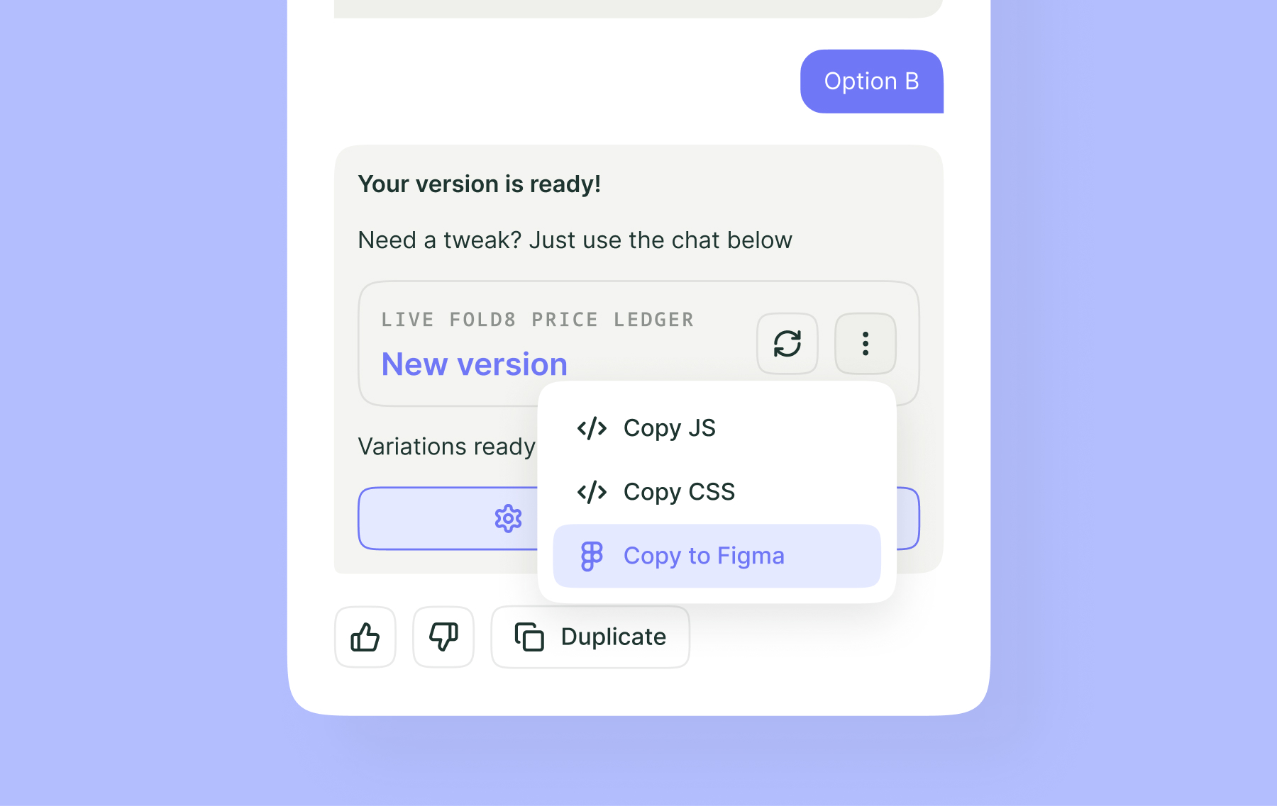
PBX closes that gap. It reads your live site, writes each variation as production-ready code, and runs it against your real traffic. The experiment lives where your customers already are, based on brand rules you've already set.
{{cta-block}}
.jpg)

The prompt
Within the Simple hero section, keep the "Simple" headline, replace the supporting line with "Choose your path in under a minute," and add a compact path chooser beneath it. Introduce it with "With the Simplicity Plan ($30/month per line), you can:" and three clickable chips, Keep, Buy, and Upgrade, each with a right-arrow icon that scrolls to the matching section. [...]
The prompt
Within the hero's left text column, insert a compact white-on-red panel under the "Simplicity Plan" headline (above "Get started") with a bold mini-heading "What you get" and four bullets: unlimited talk & text; unlimited data on our network; hotspot included; and pick your phone, keep it, buy new, or upgrade. Add an underlined "See what's included" link to the FAQ. [...]
Visitors stall when the next step feels unclear. These tests are designed to remove a piece of that doubt: a clear set of paths, a goal-first filter, and a plain summary of what the plan includes.
Importantly, none touch the branding, and PBX handles responsive rules so the mobile layout holds up.
The prompt
Within the Solutions Tabs Content Block, insert a goal picker above the segment tabs, labeled "Start with your goal:" with four pills: "Get reliable internet", "Connect my team", "Improve customer support", "Get set up with tools." Selecting a goal reorders the four cards so the most relevant two appear first, then demotes the segment tabs below. [...]
Try PBX on your own site
Every test here started as a sentence. If your team has a Verizon page you have wondered about, PBX turns the question into a live test in minutes.
Try PBX on your own site
Every test here started as a sentence. If your team has a Verizon page you have wondered about, PBX turns the question into a live test in minutes.