How to optimize your landing page with A/B testing
This article is an introductory guide and checklist for optimizing your landing page for conversions.
If your team has experience in optimization or experimentation, we have more advanced pieces that cover using different kinds of data, moving to server-side experimentation, and more.
However, this guide will be helpful for those relatively new to optimization.
Kameleoon is an enterprise tool for teams who want to maximize their A/B testing. While becoming a leader in experimentation takes experience and high-level buy-in from key company decision-makers, any company can start laying the foundations by A/B testing elements and versions of their landing pages.
We've created a simple framework any team can follow. Below, we'll go over 9 micro-variants in a landing page that you can optimize and 3 macro ones. Then, we'll explain how to create hypotheses and A/B test them.
1 What is A/B testing ?
A/B testing, also known as split testing, consists of comparing two versions of a page with two samples of similar audiences to determine which variant performs better according to the set objective.
Part of your audience is directed to Variant A, while the other is assigned to Variant B. A precise statistical analysis then allows you to know which one converts the best.
A/B testing is a strategy based on experimentation, which can be iterated infinitely by gradually eliminating "losing" versions. However, it all depends on the size of your audience. The more versions you add, the smaller your audience samples will be since you must divide them.
Experimentation can take other forms: split URL testing, multivariate or MVT testing, and A/A testing. Our article on A/B testing goes into each one.
2 Why optimize your landing page with A/B testing?
Understand your visitors better
When you perform an A/B test on your landing page, visitors show you what they like and don't like about your page, which can lead you to see where there is friction.
When you use your gut feeling to optimize your site, you risk wasting time and resources fixing problems that don't exist from the user's perspective or misunderstanding their pain points. A/B testing lets you make decisions based on your visitors' behavior.
Improve users' experience on your site
Knowing your visitors and your audience better will allow you to optimize the experience on your site. By A/B testing your landing page and its elements, you can test several user paths and therefore identify the most efficient—the one that orients towards the ultimate objective of your page (a download, a registration, an appointment, etc.)
Validate or invalidate your intuitions
When you first create your landing page, the structure, UX and copy are informed by your intuitions.
- "I think this form is pretty clear."
- "This visual matches the value proposition well."
- "This is the best pricing offer."
However, the original lading page is never the one that produces the maximum value. Sometimes, intuitions are entirely wrong.
With A/B testing, you validate your intuitions, now called hypotheses, using data. You're now moving beyond subjective assessment.
Boost conversions and improve your ROI
Acquiring high-quality traffic is expensive. By A/B testing your landing page, you can focus your time and effort on what works best for your target audience. Squeezing the most conversions out of your visits is not the ideal way to view the purpose of experimentation—you should be trying to build a holistic, data-informed picture of your customers. However, A/B testing, even in its most elementary forms, can increase your conversions while maximizing your return on investment.
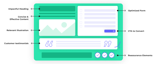
3 What elements to A/B test on your landing page?
There are two types of variants: micro and macro.
The micro-variants concern small elements.
- Titles
- Visuals
- CTAs
- Fonts
Macro variations are significant overhauls to your landing page, both in terms of the structure of your page and the value proposition presented to your prospects.
MICRO-VARIANTS
Titles
According to a study by CopyBlogger, 80% of people who read a headline never read the rest of the content. A title should hook your visitors, keep them reading, and decrease your bounce rate.
Test several formulations to determine which one will hit the mark. You can experiment with completely different titles or change just one word in your headline. Sometimes one word can make all the difference.
Four tips for writing 5-star headlines:
- Think in terms of product benefits, not features.
A title should be concise. Prioritize what sticks the most with your target audience. Benefits are what your product or service brings—your promise. For example: "Get dreamy hair with this brush." The feature is what your product is. "The bristles of the brush are enriched with vegetable keratin."
- Respond to the main objection of your target audience
Your visitors have a pain point that you are going to solve. You can also highlight it in your title. Example: You offer an SEO optimization tool. "You don't have to be an SEO expert to be number one on Google."
- Address your target
Use the "you" or the "your" in your title.
- Highlight a number
If you can, highlight an impactful number. Figures allow us to project ourselves on concrete results we can obtain. Examples: "Triple your conversion rate with our A/B testing tool," "Learn how to write content that converts in 6 days". However, be careful not to overpromise.
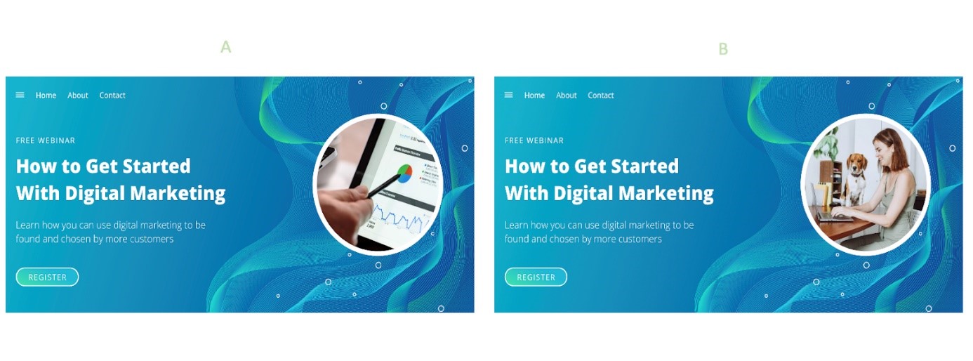
The visuals
Another essential element on a landing page is the visuals. They not only dress up and structure your page but also illustrate your message.
You can test two different static images (example below) or put a picture in version A of your landing page and a video in version B. You can thus determine which visuals and formats your visitors prefer.
Note that you can also test a "clean" landing page version. Some landing pages with no or very few visuals can achieve high conversion rates.
The CTA
The call-to-action button or CTA is the essential element for conversion. The idea is to test its wording, size, color, and location.
Say you're selling a hairbrush. You could, for example, test this text:
In version A: "I want dream hair," and in version B, "My ideal brush right now."
The form
Also essential to conversion: the form. This is usually the first touchpoint where the customer actively interacts with your business. A poorly constructed form is a great way to exponentially increase friction and push most of your visitors to bounce.
You can test several variants on the form, such as the number of fields, the information requested, the wording, the color, etc.
A word of advice when building your form: only request the data you will use. For example, do you need a "message" field at the bottom? Is it worth getting tons more people to drop off to obtain their names?
Social proof
Social proof includes logos from your customers/clients, testimonials, and customer reviews. Again, you won't know which stories will speak to your target audience without testing. A/B test your social proof by changing your customer logos and putting different testimonials and customer reviews on your landing page.
The Copy
The font, just like the visuals, also matters. Depending on the device used, it may be too small, too big, or too compact for your visitors.
Text
Modify the copywriting of your texts, whether at the subtitle level or the sections presenting each of your benefits. As mentioned above, using different words or formulations can affect and encourage conversions.
Back to our hairbrush: If our text says that our brush has bristles enriched with vegetable keratin, most visitors may not understand what vegetable keratin is. Would explaining this further increase the time on the page? Or is it better to remove this and focus only on the benefits entirely?
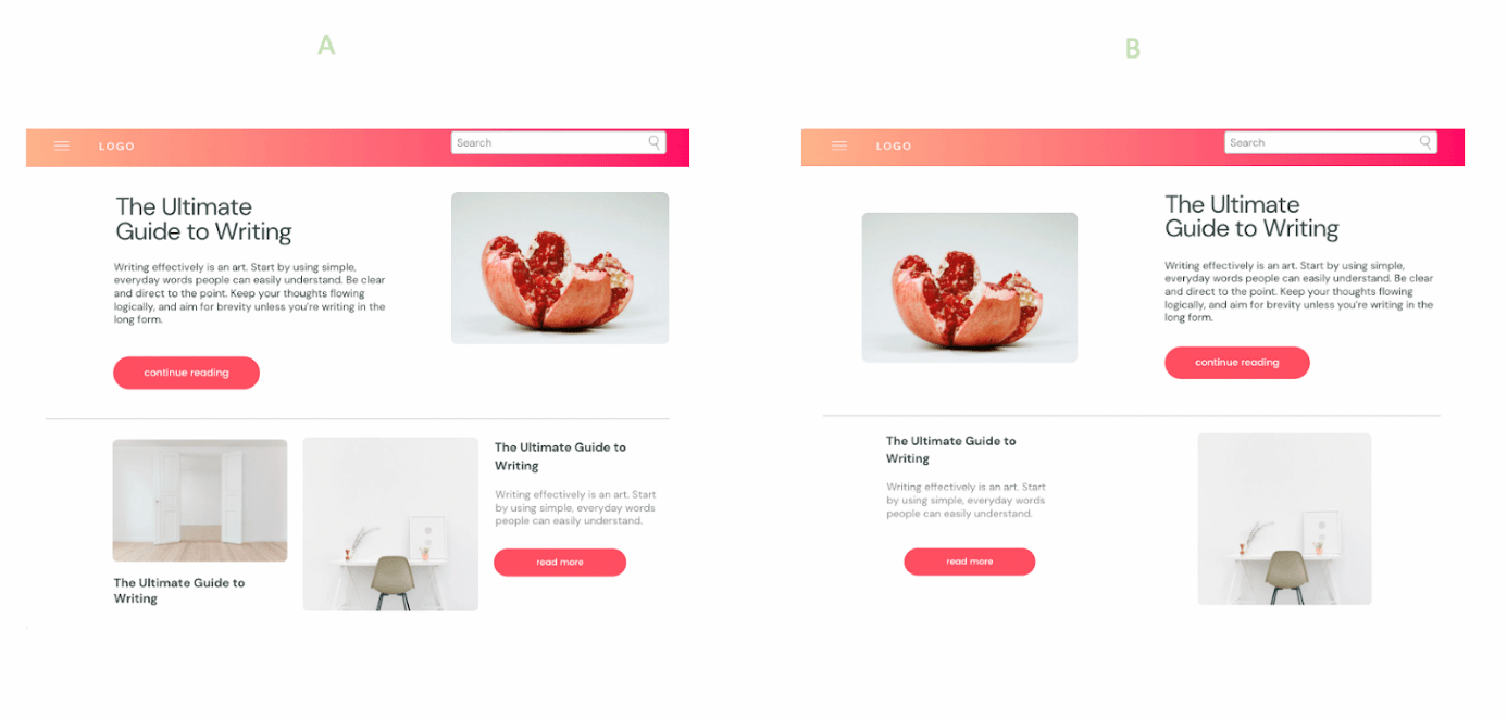
The structure
A landing page consists of different blocks.
- The Hero: A section users see when they land on the page, usually including a title, a subtitle or brief description of your product/solution, a CTA, and a visual.
- The benefits of your product or solution
- The social proof section contains your customers' logos and some testimonials.
- CTA
This structure is the most often used (and recommended), but nothing prevents you from playing with the different blocks and seeing what works best on your conversion rate. The Hero section is a given for almost all businesses. However, you can still test the layout of the components. E.g., putting the visual on the left or the right.
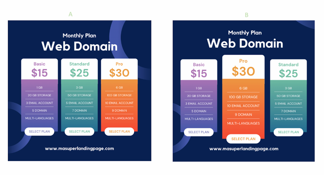
The offer
You can test the presentation as in the image below or only test your price. For example, instead of $30, we could put $29.99. Why does this old technique still work? People focus more on the first digit than the one after the comma.
Below are some examples of micro-variants that you can test. This list is not exhaustive.
Note: The most impactful elements are located "above the fold"—the part of your landing page displayed directly to users before they scroll down. Here is where your Hero section is, and that's why it is so important. Above the fold, you win your visitor's attention. Below, you put him in confidence, and you convert.
Macro-Variants
Macro variations are substantial overhauls to your landing page.
The value proposition
You can completely switch up your value proposition. The one you thought best might not be suitable for your target audience.
Furthermore, pricing experiments can be invaluable for understanding which features your customers truly value. We've all seen pricing tier tables with free, paid and premium product plans that include different features.
Beyond increasing conversions, A/B testing these tiers can help your company make product development decisions based on customer data.
Again, the value of A/B testing comes down to its power to generate rigorous customer insights.
The structure
The structure of your landing page can be a micro-variant, or a macro-variant if you completely modify your page. E.g., changing the place, presentation, and length of your sections.
For your Version B, you can, for example, cut your page in two or reduce it by half. Reducing the amount of content can concentrate your visitors' attention.
Combine several micro-variants
It is possible to test several variants simultaneously: title, text, visuals, and structure. These micro-variant changes form a macro experiment because your page will differ entirely from the control.
In A/B testing, we talk about MVTs ("multivariate tests"). The idea is to simultaneously test all the possible combinations of several elements on the same page to identify which has the most impact on its conversion rates. We invite you to read our article on MVT tests.
4 A step-by-step guide to optimize your landing page
Identify what to test
You can test all the elements presented above: the title, the visuals, the form, the CTA, etc. But your tests should not be blind. The purpose of A/B testing is to experiment with the elements that specifically cause you problems (and therefore need to be optimized.)
- Is it the time spent on your landing page? In this case, reviewing your title, visuals, or texts may be necessary.
- Is your form dropout rate too high? The hypothesis could be to remove some fields.
- Are your mobile visitors clicking less on the CTA than the web users? The button's color may not be visible enough on mobile.
Your assumptions should be clearly defined and based on data. That's why using information your organization already pulls is critical to identify points of frustration on your landing page.
Kameleoon has native integrations with the leading user experience and analytics platforms, including Mixpanel and Contentsquare, so any team can easily tap into their customer data.
Analyze each KPI:
- Bounce rate
- Time on page
- Click through rate
- Conversion rate on the form
- Etc.
These metrics will allow you to identify which elements of your landing page are hindering engagement and, therefore, which need to be optimized. Then determine your primary KPI for your A/B test(s).
Prioritize tests
Prioritize the most relevant tests for your objective. In this prioritization, however, consider the technical complexity of your A/B testing, especially if you decide to change the elements yourself.
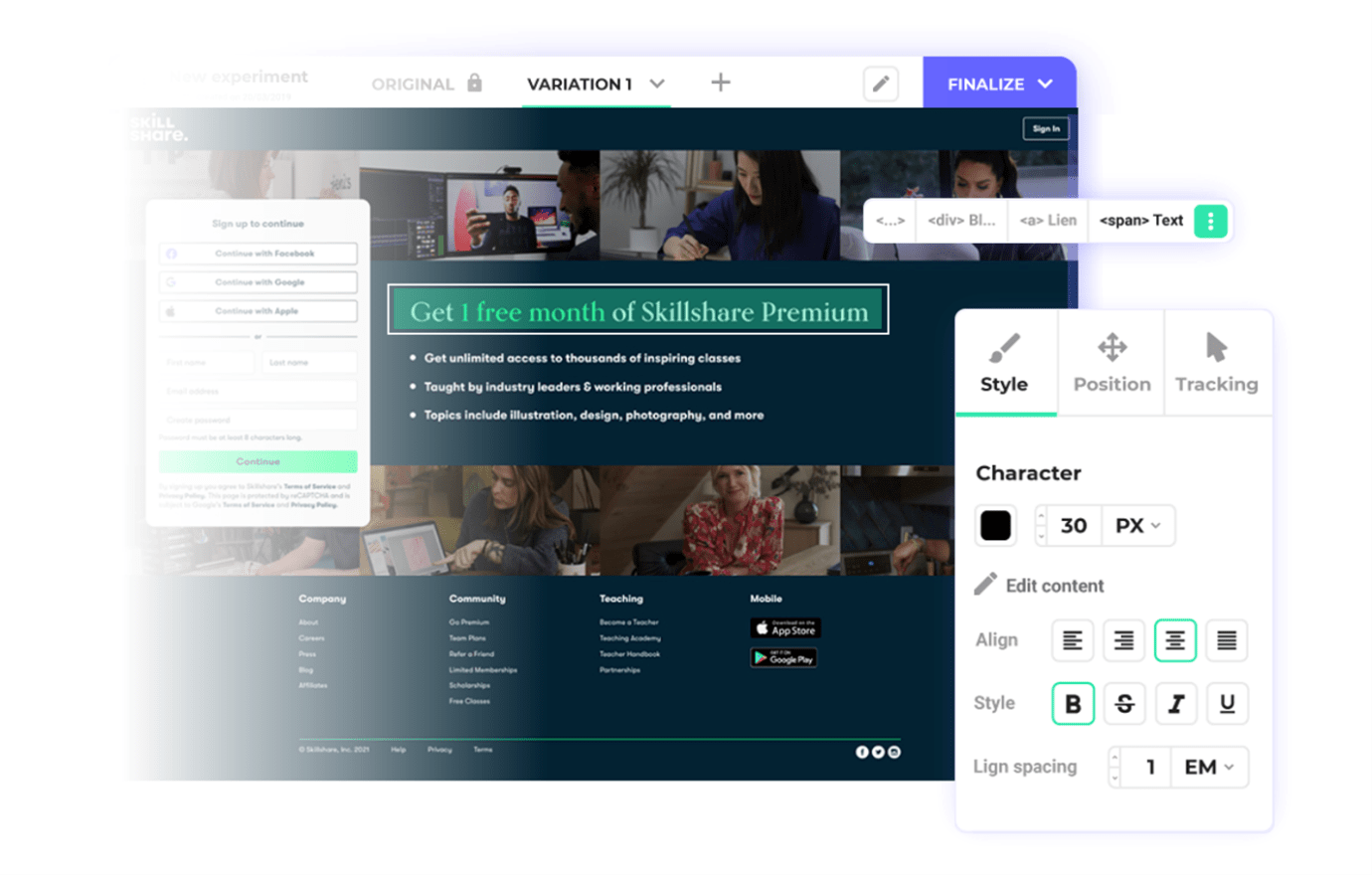
At Kameleoon, our graphic editor lets anybody easily modify any element of a landing page without requiring developers.
Proceed to testing
Once you identify your objectives and prioritize your tests, you can launch your experiment.
What are the steps to A/B test your landing page?
1. Only run one A/B test at a time
Limit yourself to testing only one variable at a time at first unless you are familiar with multivariate testing (MVT).
This "macro" test requires high traffic and some expertise.
Also, do not run several different A/B tests simultaneously (a specific variation for each test). The risks: you will get tangled up, and some visitors may inadvertently browse several versions of your landing page.
2. Publish
You publish Version A and Version B of your landing page to two samples of your audience. One part will have the original page, and the other will have your page with the variant.
Before starting your test, however, ensure everything is working correctly.
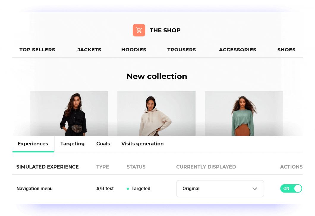
At Kameleoon, our A/B testing tool has a simulation mode, allowing you to preview your test (on mobile and desktop) and accept your scenario from A to Z in actual conditions (graphics, audience, and KPI) before putting it into production.
3. Collect relevant data
For your test results to be statistically valid, you need to achieve a large enough sample size (number of people exposed to the test).
To calculate the necessary level of traffic, you need to take into account:
- The original conversion rate
- The minimum expected effect on the conversion rate by the variant
- The confidence threshold for which an effect is detected
- The confidence threshold for which an effect is detected when it does not exist
Don't know what these mean? Make sure to read our article, A/B testing, what traffic for a reliable result?
Even if you reach your "threshold," we recommend leaving your test active for several weeks (at least 2 or 3 weeks) because your visitors' behavior may change.
4. Analyze and interpret the results
The first thing you should analyze is your main KPI.
Has your goal been achieved? Is it significant?
In A/B testing, there can be false positives and negatives.
5. Iterate
You have your winning version, but your test doesn't end there. You will need to check that it also has positive effects on all of your traffic and not on just one small part. The danger in A/B testing is drawing the wrong conclusions. By iterating on your test, e.g., applying that variant to more audience segments, you will be able to know the real winning version of your landing page.
5 Examples of landing page optimization
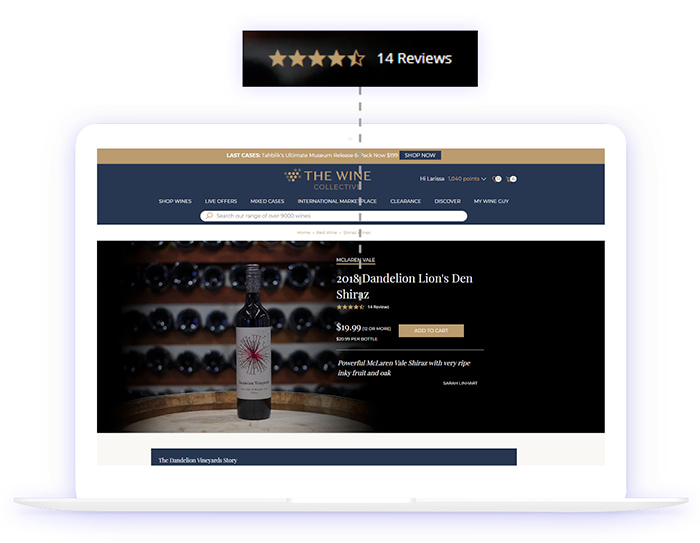
The Wine Collective is an established e-commerce store in the online spirits industry. To grow, they embraced A/B testing and personalization, using data to prove their assumptions wrong.
the A/B tests The Wine Collective ran revealed that several things the company took for granted were false, resulting in a huge opportunity cost.
The Wine Collective discovered that:
- Having clean product pages wasn’t what their customers wanted. The product pages performed way better with the addition of one other element. (Can you guess what it is with the picture below?)
- A large portion—30%—of homepage visitors were not who The Wine Collective thought they were.
- For years, holiday campaigns were missing an ingredient that would take them from being just “OK” to resonating with loyal customers like never before.
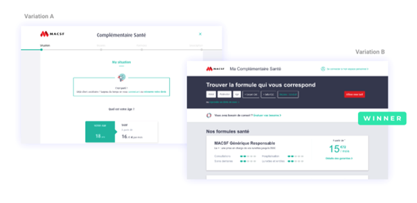
Another example is MACSF, who wanted to increase the number of subscriptions by simplifying the quote request tunnel.
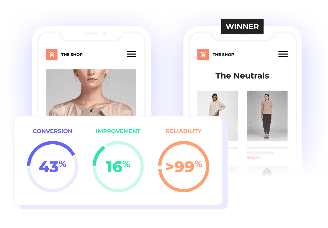
To do this, the French mutual insurance company tested two versions of its page: 10 steps on Version A against 6 steps on Version B. After an iteration phase, the results validated Version B with a 25% increase in the subscription rate.
A/B testing is a proven method. By comparing several versions of your landing page, you can test different hypotheses and thus increase your conversion rate in an informed way.
Optimizing your landing page using A/B testing requires rigor, meticulousness, and an experimentation tool that meets all your needs. Want to know more about Kameleoon's features? Request a personalized demo.